
Alexandria came to us with a product that could predict the future of the stock market and an image that reflected the past. That identity was put to rest with an overhaul that kept alive the idea of the ancient library of Alexandria but pushed it forward into the modern, cutting edge world in which they compete. Their product seeks to simplify the overwhelming amount of investment information produced daily into a graphical representation of market sentiment and their new identity supports that mission.
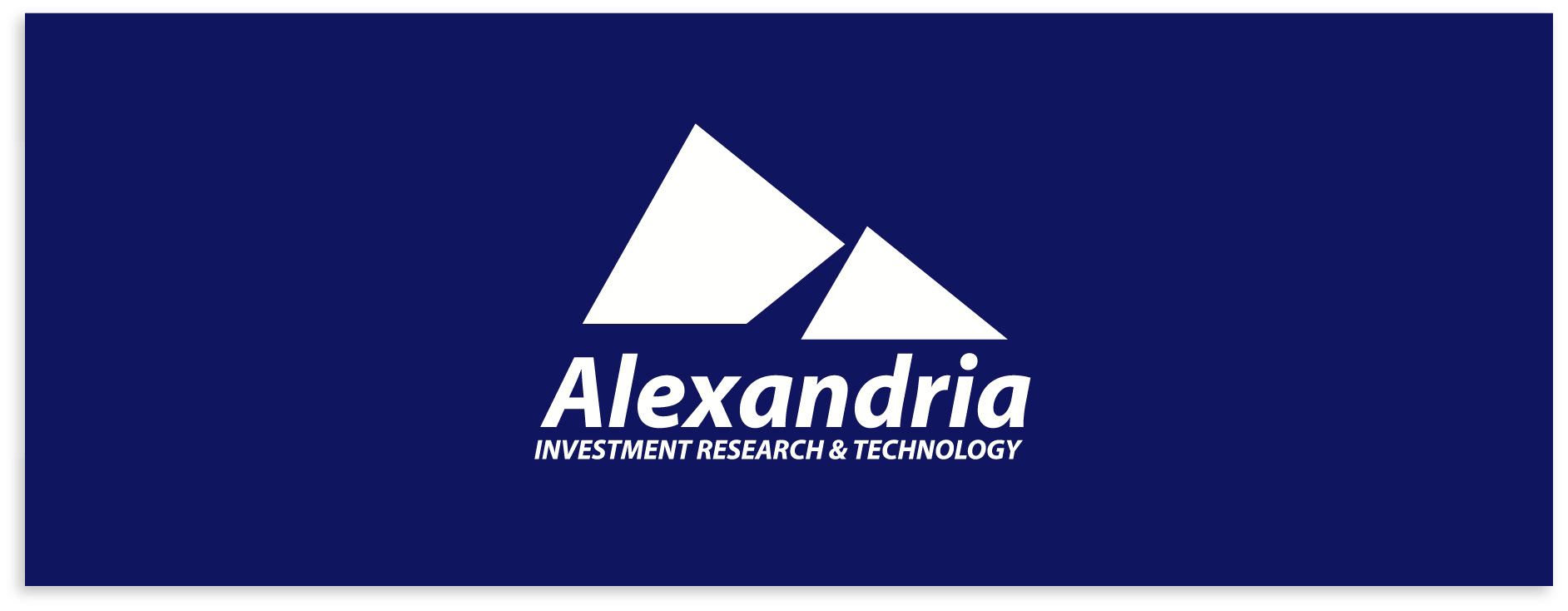
The Alexandria logo is a simplification of pyramids with the sun illuminating the forward faces and the negative space in shadows. As such the logo works best in white against a colored background which provides them with a unique look when used with consistency.
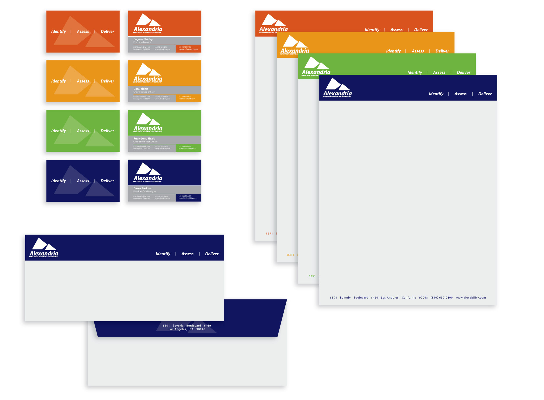
The Alexandria palette is flexible although blue is used as the default corporate color while the other three are used for supporting materials.
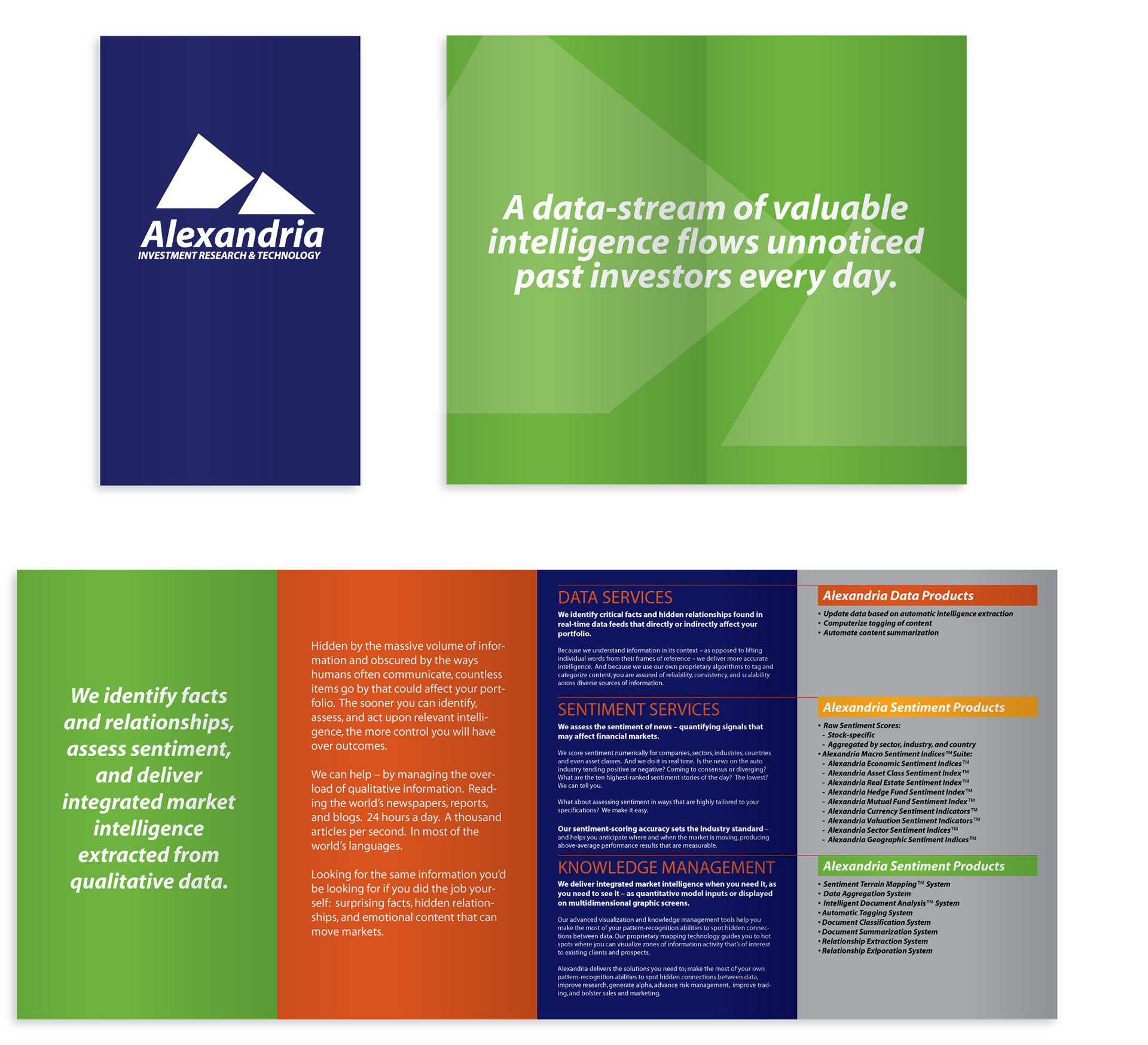
The double gate-fold brochure communicates a wealth of information, encouraging the user to explore Alexandria's interactive UI for themselves.