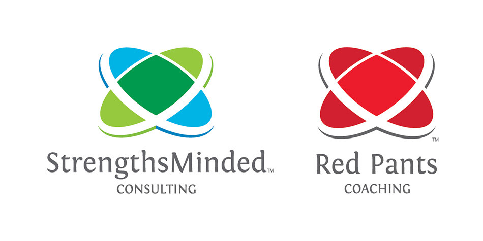
Strengths Minded Associates came to me with an interesting business model. The business is a partnership run by two professional coaches, Angi Dahl and Marlies Lloyd. The interesting part is that they each have their own coaching businesses on the side. During the concept generation phase, we pursued the abstract nature of the two coaches coming together to create a third entity; related but different than the two on their own. Naturally, the word Strengths was a good jumping off point and that was the origin of the final logo.
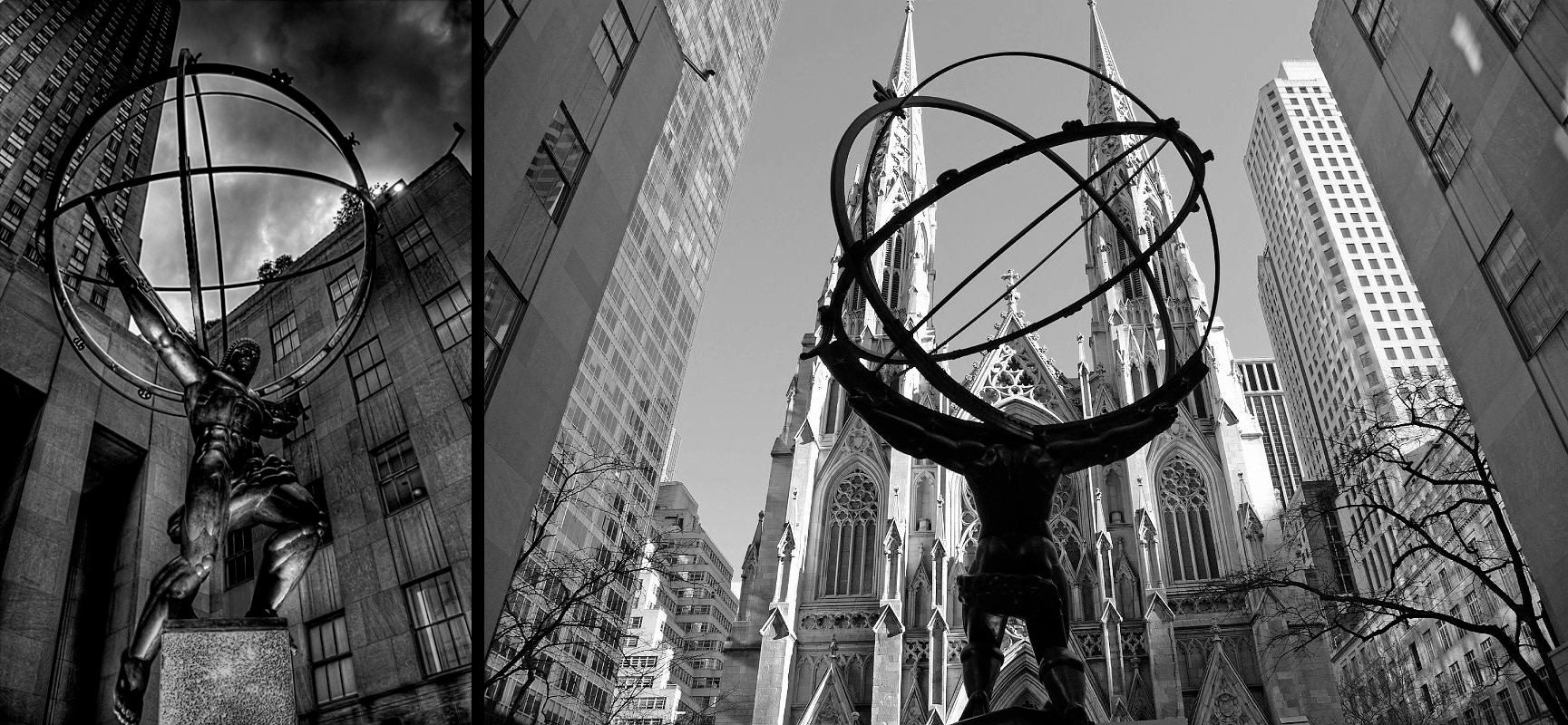
The famous 1937 statue of Atlas by Lee Lawrie which sits in front of New York City’s Rockefeller Plaza and across from St. Patrick’s would become the inspiration for the eventual logo. Atlas himself was both too literal and too confusing to apply to the Strengths Minded brand – it’s not a gym after all. However the globe that Atlas is upholding is made of intersecting circles, placed on different planes. Now that aspect was familiar to the brand: two people approaching the same opportunity from complementary perspectives is the abstract origin of the company. And two circles, both equal, but on separate planes conveys that. And if we translate their perspectives as two lenses of different hues, the overlap creates a third unique and richer hue.

This logo was then applied to each partner’s business in similar ways. Angi would retain both the Strengths Minded name, logo, and colors while Marlies would retain the logo with new colors that better reflected her brand name, Red Pants Coaching.
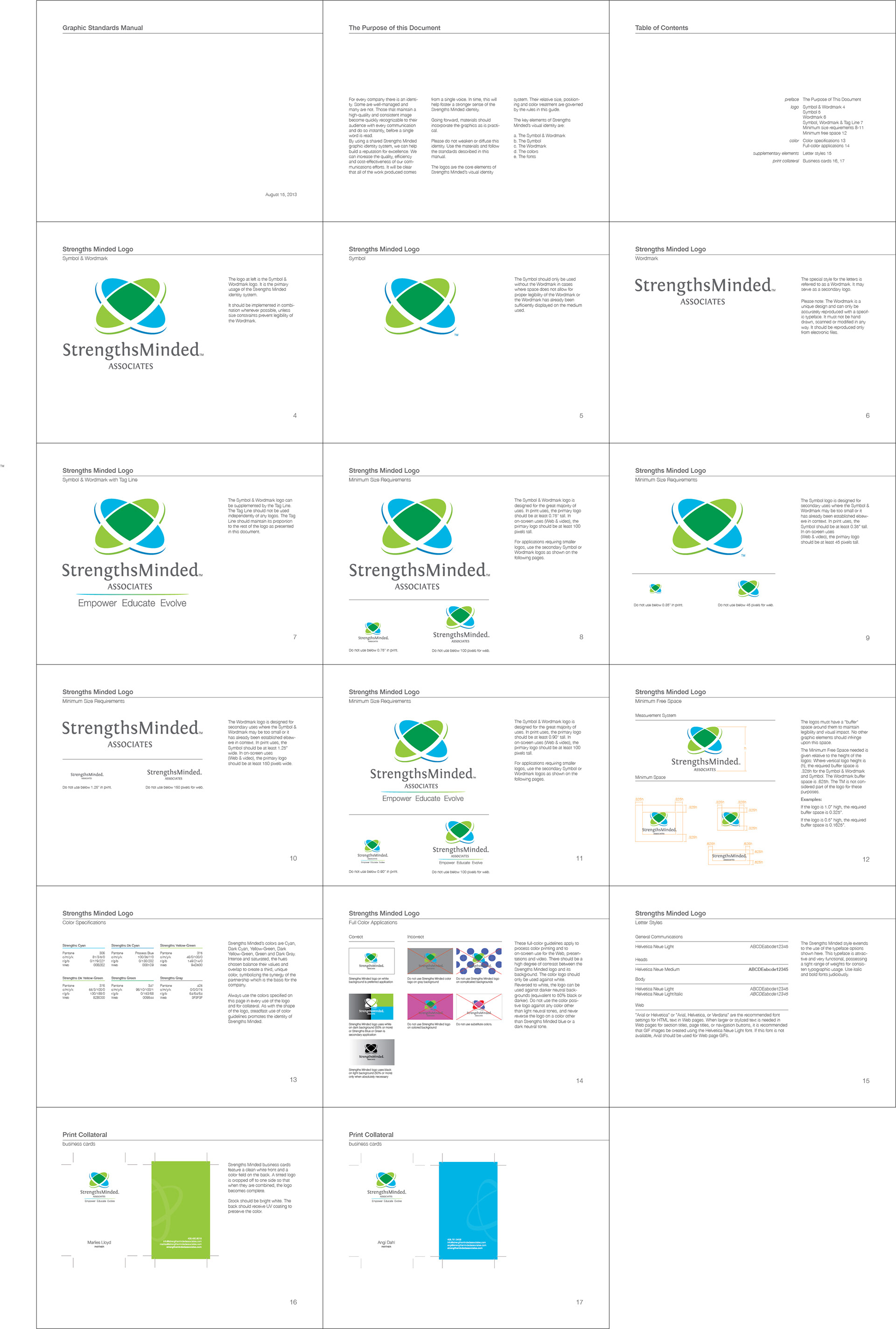
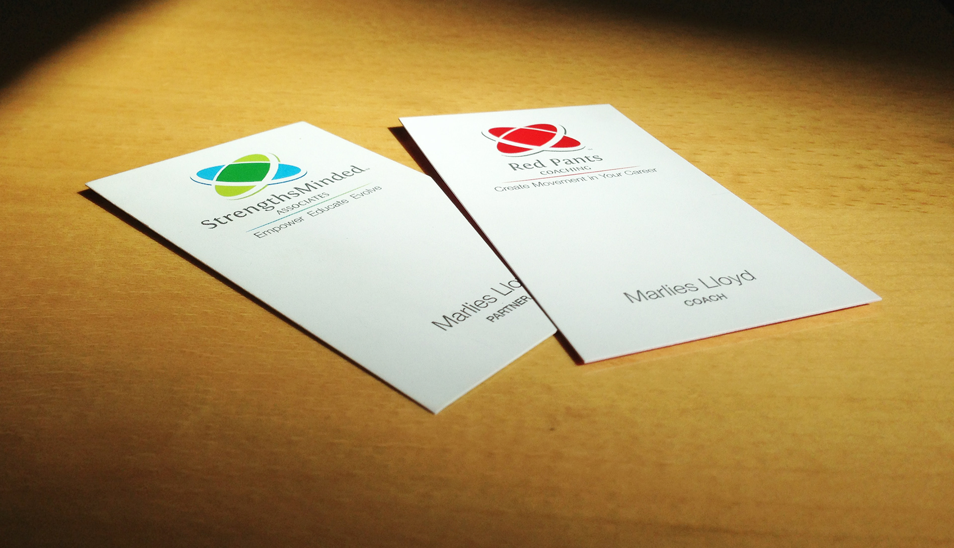
As with any visual identity I create, a Graphic Standards Manual is included as part of the package. It is not One of the fun aspects of this job was implementing the design strategy. We went with a clean, white front to help establish the brand with a minimum of clutter. The back has a field of color with the contact information. It also features a ghosted logo cropped to one side, though not the same on each card. When you align the backs of each of the Strengths Minded partners cards, the logo becomes whole. What’s more, pair up each of Angi’s or each of Marlies’ cards and once again, the logos become complete.

No brand identity would be complete without its Graphic Standards Manual and C Davis Designs provides one (or in this case three) with every brand identity it creates.