To say this campaign identity was a personal to its designer would be an understatement. C Davis Designs worked along with an experienced strategist to win Chris's wife a seat on the city council of the country's 10th largest city: San José, California.
The key to any good identity is knowing your product's or service's comparative advantages as well as the landscape of the market. The design must distinguish the brand from the rest of the field — in this case eight primary candidates — yet look appropriate to the office being sought. This was a crowded field in a district that is home to 100,000 people, yet the budgets are relatively small. Efficient use of resources would be key to creating a strong image for Dev in the minds of voters. Being a presidential year posed a further challenge. Not only were we competing for mindshare among the candidates for City Council, we were also competing against the substantial advertising generated by all the other office seekers — those at the county, state, and federal levels.
The first step is always getting to understand the strengths and weaknesses of the client to ensure that we can best establish the brand as superior amongst those in the field. In this case, Dev had excellent credentials — her two Stanford masters degrees in fields closely related to the office and her professional experience as a public policy analyst. Many of the competitors sought to stake their identities on neighborhood activism, so it was important to pay attention to that area and avoid being outflanked there. It was not necessary to win on that topic so much as to neutralize any advantage competitors may have. With half the field trying to emphasize that same point, none would be able to stand out amongst their peers.
There are a lot of moving pieces to a campaign, so it is important to keep everyone on the same page to establish an identity, both visually and contextually. That is where the Graphic Standards Manual comes in. It ensures that all communications are consistent and on message. Doing so builds trust in the brand and emphasizes those key advantages.
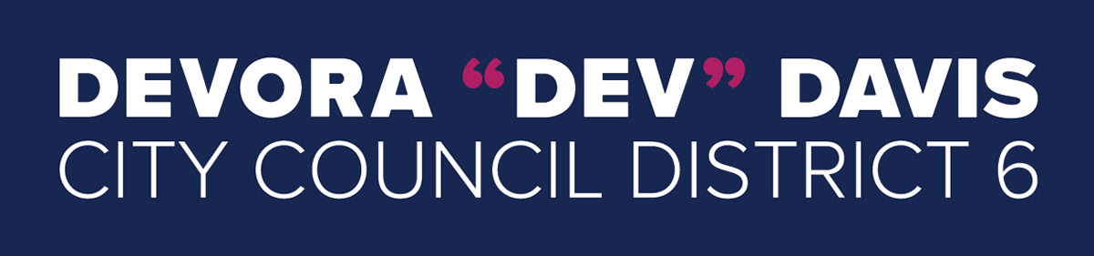
The project began at the absolute ground level: what is the brand name? This question was given the careful consideration it was due. Everyone who knew her knew her by her nickname, "Dev." However, those who were unfamiliar with her would sometimes make false assumptions of both gender and ethnicity. By using her full name, "Devora", we were able to communicate that our candidate was female. This was an advantage, given all other candidates but one were male. The brand would become Devora "Dev" Davis.
At this level of office in particular, yard signs are extremely valuable assets. They get messaging directly to the targeted areas and they tell viewers that the home owner who posted the sign has proudly given their stamp of approval to the candidate — a very strong and personal grassroots endorsement. The logotype must be effective at this scale and in this environment so it was designed with yard signs as the application of primary consideration. White lettering on a colored background provides excellent contrast, improving readability, especially in low light. Numerous virtual iterations were made with various different likely backgrounds before the final design was selected. I found a white border helped define the edges of the sign and distinguish it from the background. This is also more affordable as it allows room for the gripper on the press, preventing the need for any trimming waste.
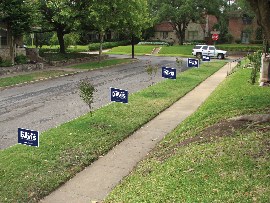
One of many iterations of simulated yard signs to test in situ visibility
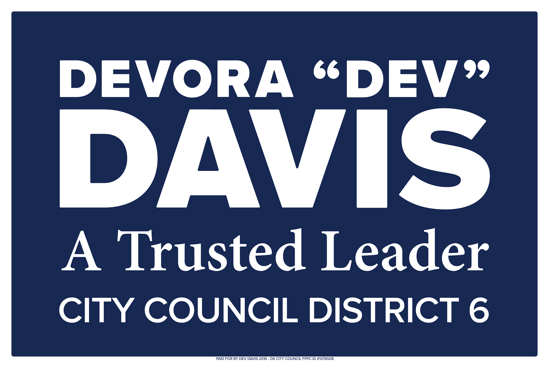
Final single-color yard sign artwork with border. The contrast of magenta and dark blue were not sufficient for use in this application as demonstrated in the simulation and thus did not justify the cost of a second color.
The logotype was meticulously constructed for a highly organized and rational implementation. This helps establish consistent graphic usage in all media.
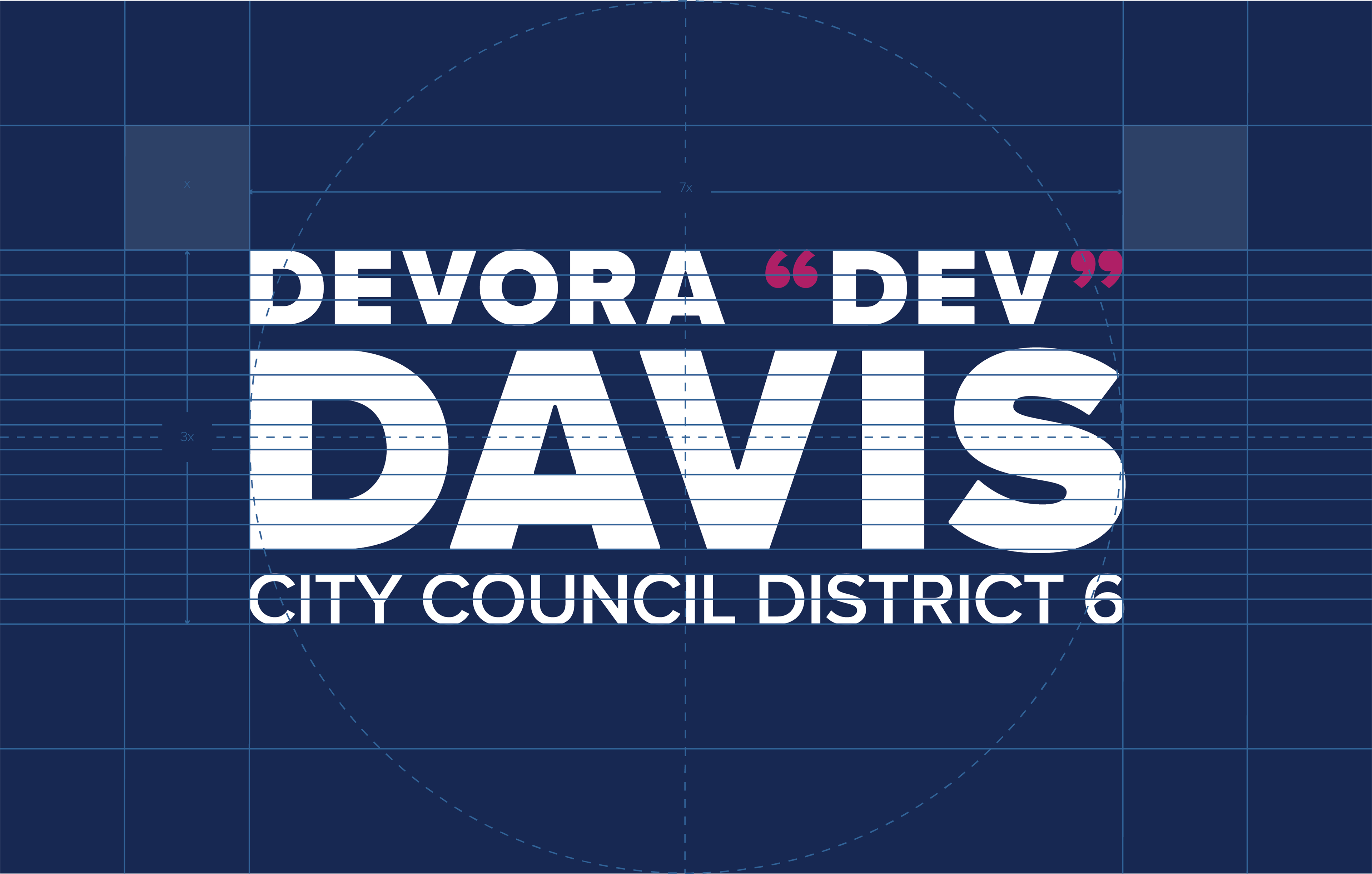
Vertically oriented logotype construction
You may note the absence of any symbol in the identity. Symbols are shorthand for all the things a brand represents and as such are very valuable. However, for smaller campaigns or businesses the cost of sufficiently establishing a connection in the minds of the target audience between an abstract symbol and the brand is beyond their budgetary scope. In terms of efficiency they can be a hindrance to efficiently communicating a message. For smaller budgets, a logotype — a specific and unique presentation of the brand name using only letters — is the most efficient use of resources. In these cases, restraint is the better part of valor. Logotypes still need to be flexible so there should be several permutations. You need applications that are horizontal, vertical, with and without tag line lockups, with dark, white, or transparent backgrounds, even other languages. Some applications can be less formal than others.
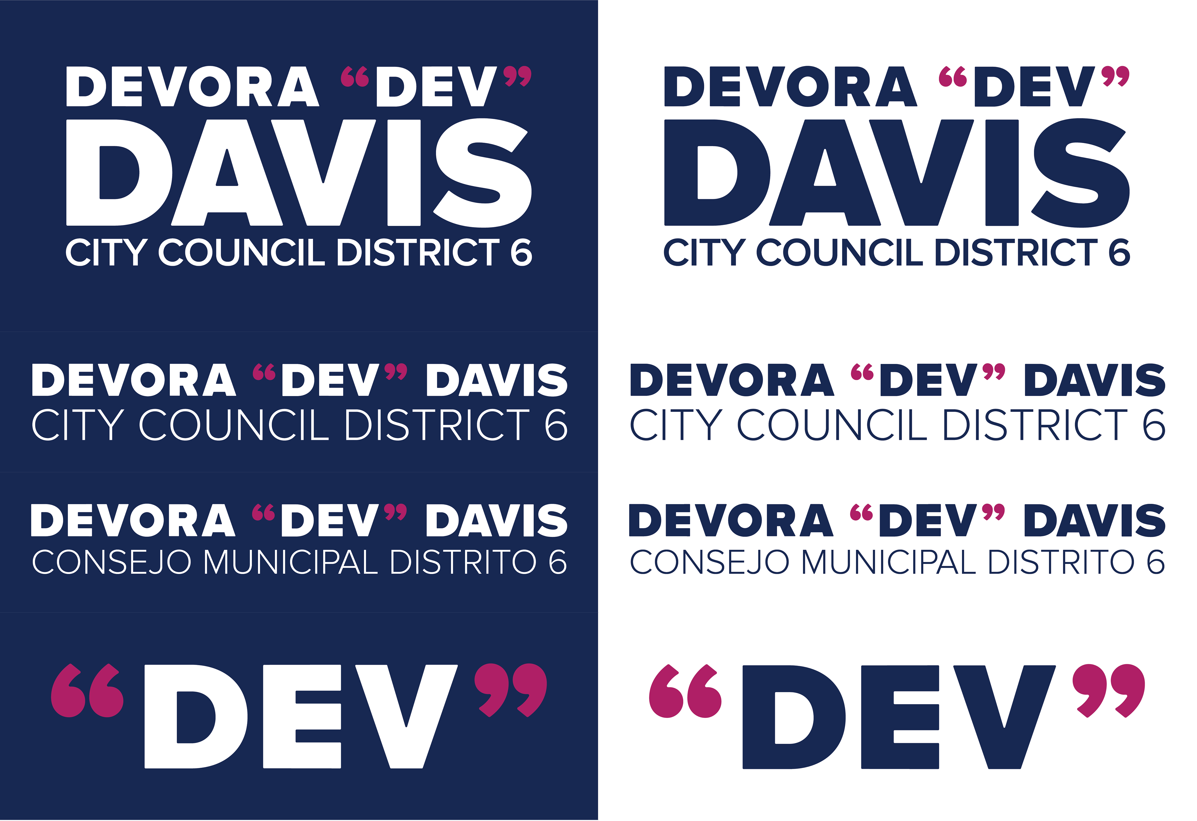
A selection of Devora "Dev" Davis logotypes and lockups
The rubber really hits the road when all these elements come together, whether it be web or print media. Note the consistency of fonts and colors, right down to the candidate's clothing.

Campaign website sample page
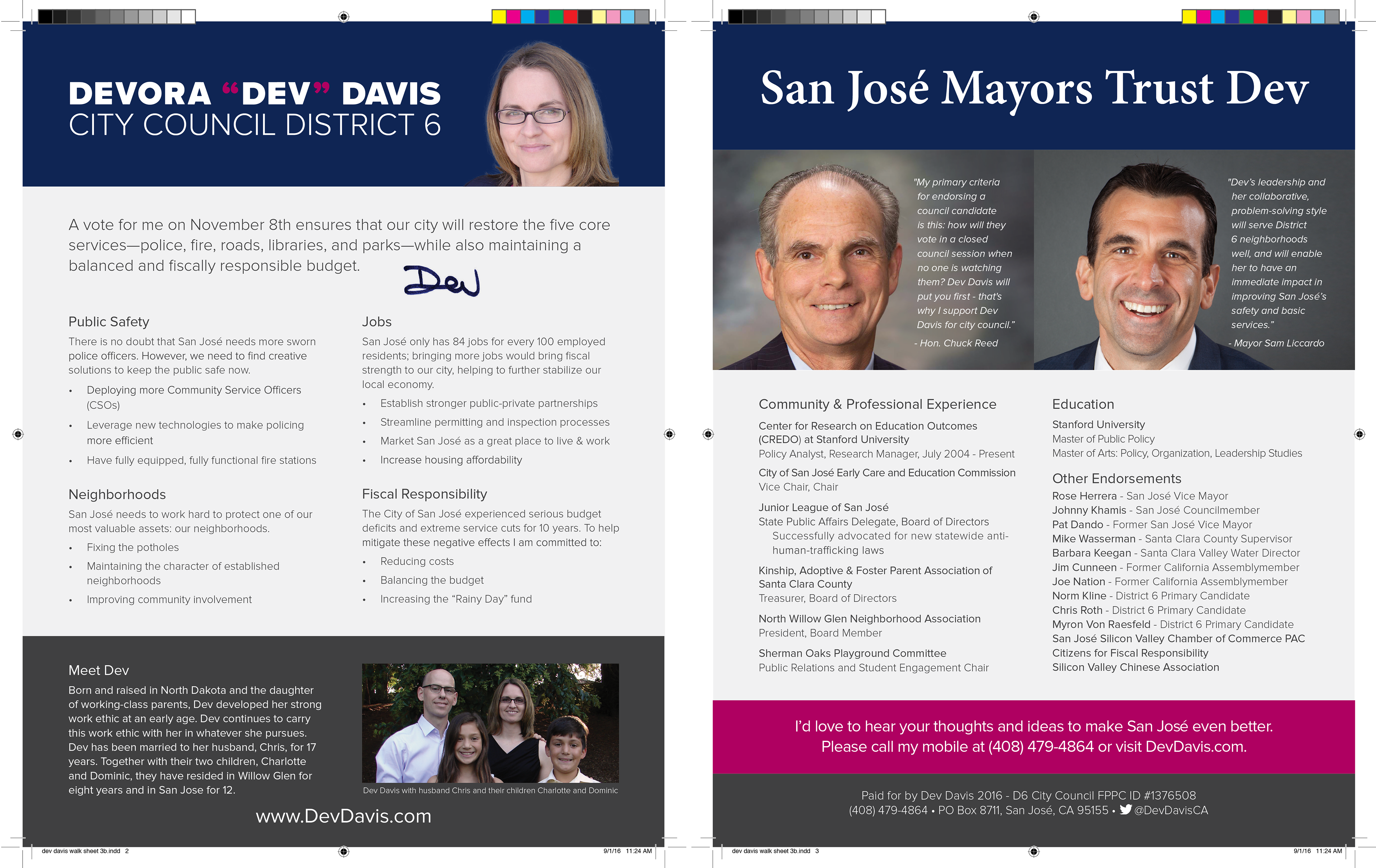
Print-ready files for walk sheets handed out in door-to-door communications
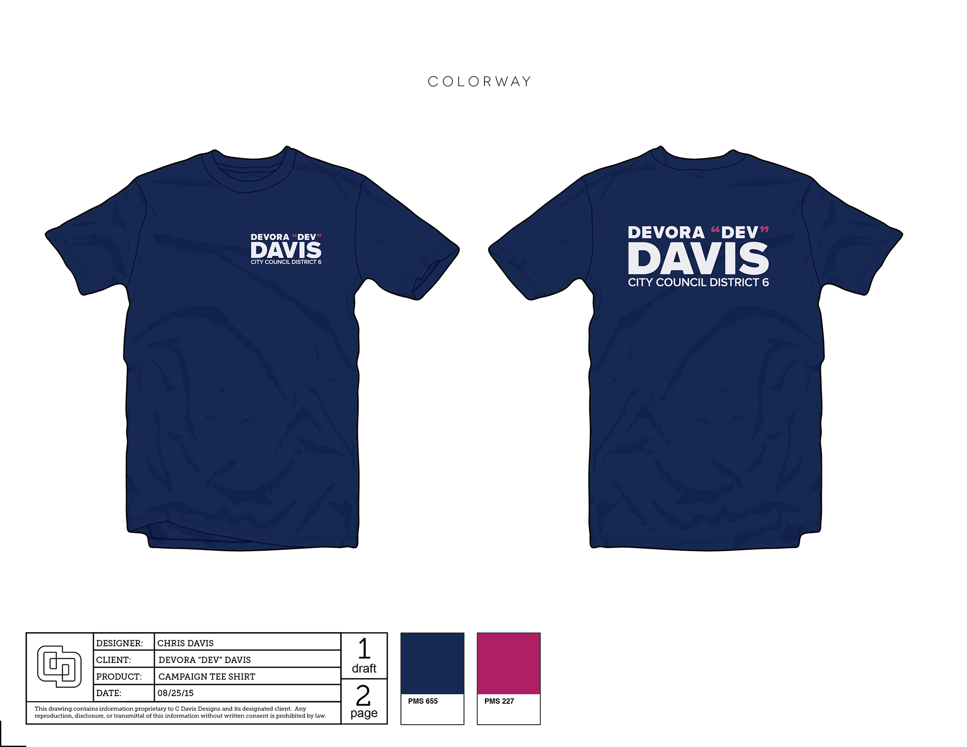
Campaign tee shirts worn by volunteers
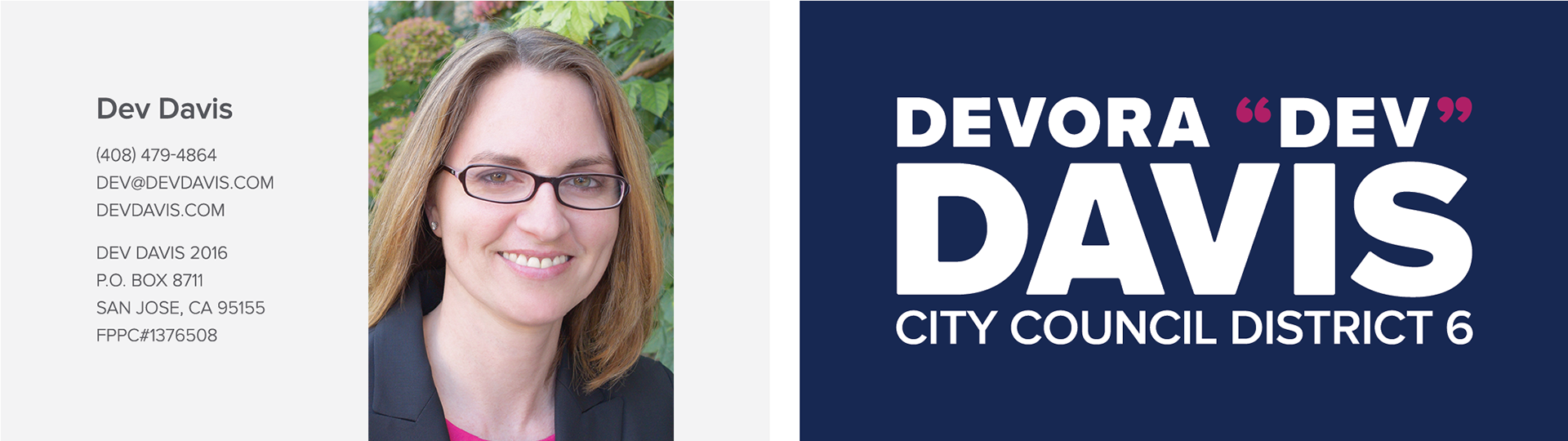
Candidate business cards
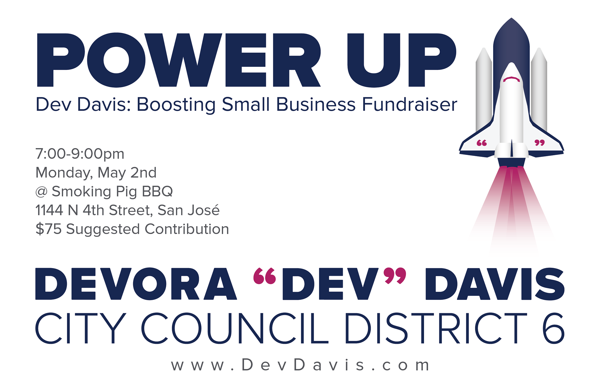
Fundraising event flier