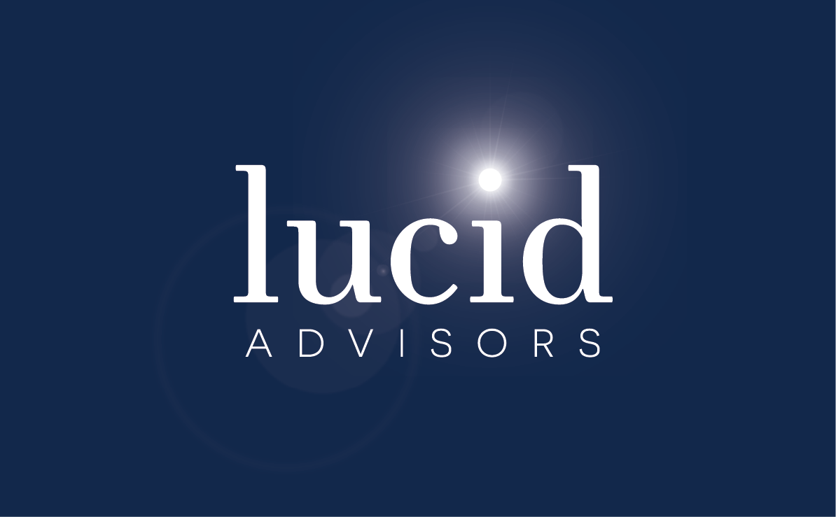
Lucid Advisors
The team at the start up management consultancy Lucid Advisors was referred to me by a past client. Together we worked to create the logotype and website that they could leverage to gain clients.
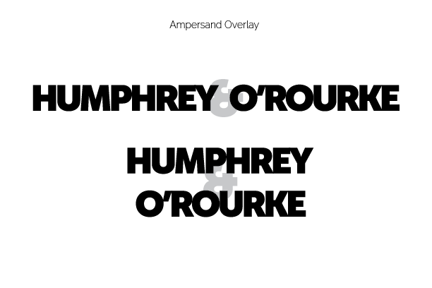
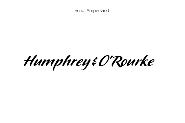
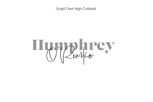
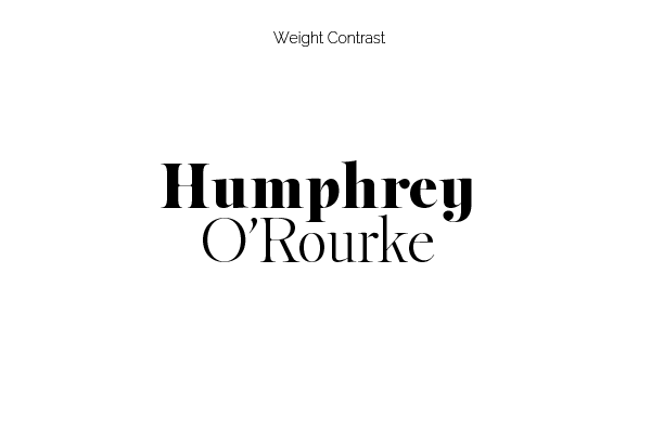
Logotype Studies
The client came to me while the project was in its infancy—before the company had even had a name. When they decided on "Lucid" as the name, it struck me as an excellent choice both in respect to its meaning and its brevity. We would definitely need to distinguish it from the electric car company of the same name. Lucid Motors also happens to be a Bay Area company like Lucid Advisors. To achieve this, any logotype we chose needed to avoid the all caps and wide letter spacing chosen by the car company.
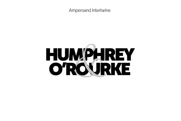
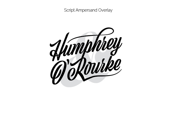
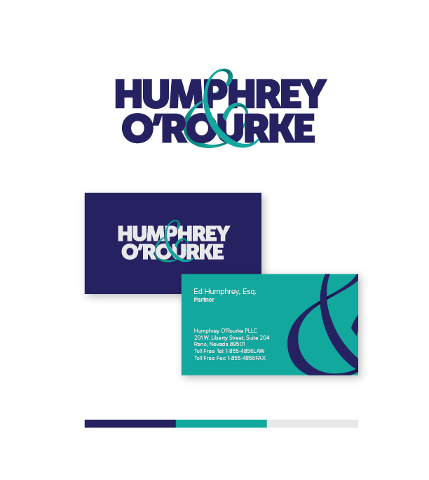
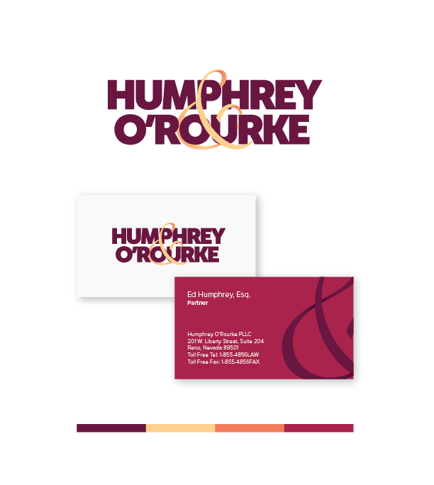
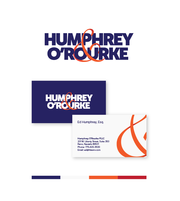
As we can tell, Ed and Patrick chose the "Ampersand Intertwine" concept. This presents their names in bold, readable text and creates unity by wrapping their surnames in an ampersand ribbon. From there the letterforms were further massaged and a gradient was added to the ampersand to give it depth ahead of the color study.
Color Studies
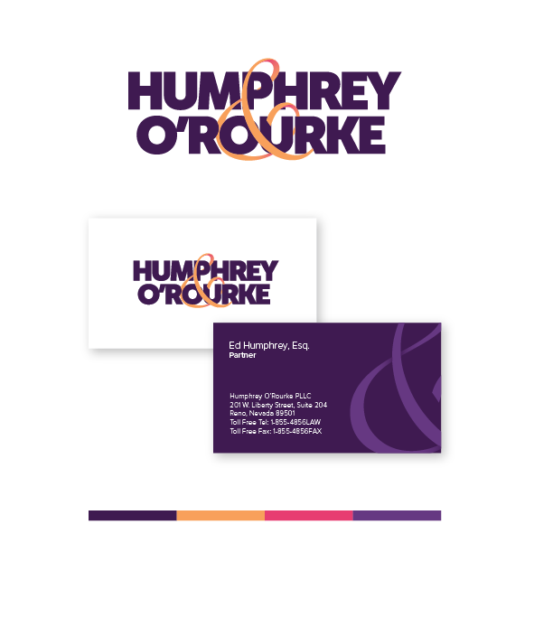
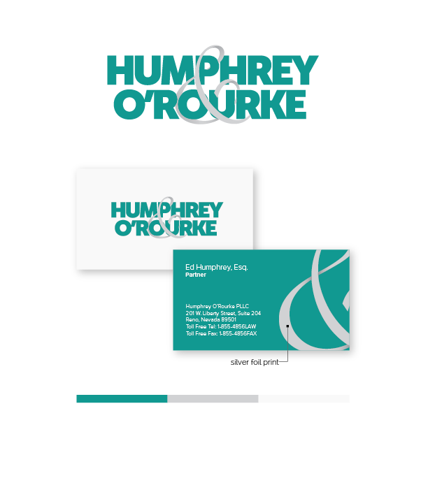
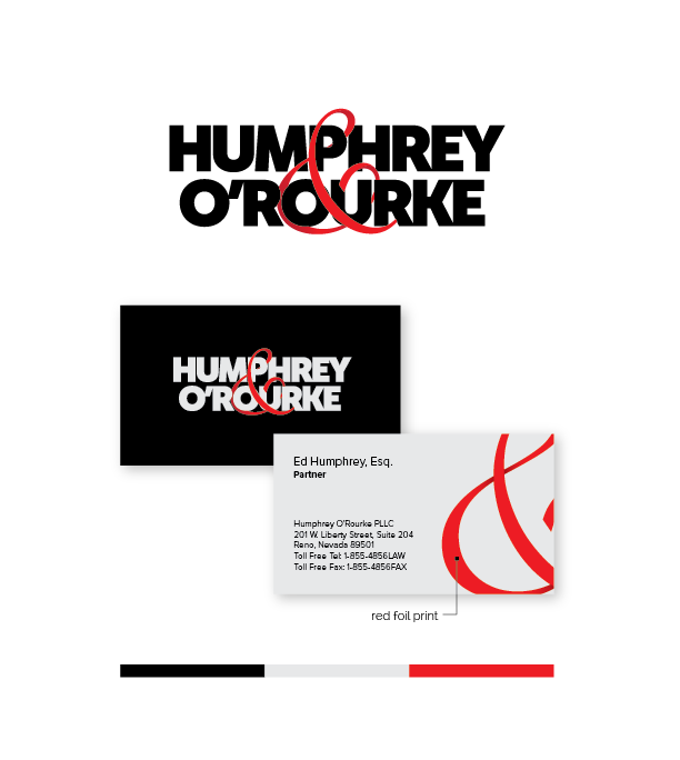
In order to maintain readability in both positive and negative versions, the correct amount of contrast in color values was critical. It was important that whether the background was dark or light, that the clients' surnames were easily read and the most dominant elements. Navy/Orange certainly fit that bill and it didn't hurt that Ed's two previous identities were also blue. The clients also requested Navy/Crimson. I presented them with the option, but guided them back to their other choice of Navy/Orange due to the legibility issue of two dark hues together. I prefer to present these studies in context so my clients and I can see the real world application of our decisions.
Graphic Standards Manual
Even the best logos can quickly turn into a mess if it is implemented poorly. For that reason, I always include a Graphic Standards Manual. Potential clients will often tell me they only need a logo. If I can not convince them that their implementation of it is more important than the logo itself I will not take the job. It is a good indication we are not a good fit for one another. See the attached file for the guide the client was provided.