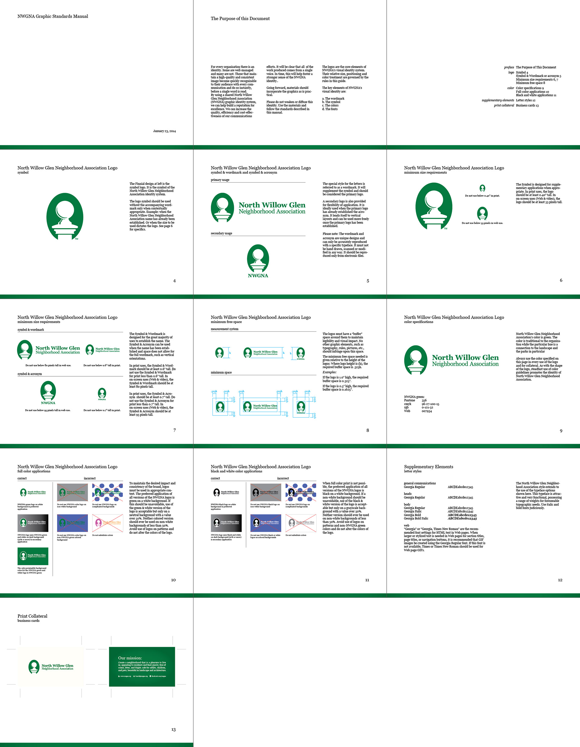
This project was designed gratis for my neighborhood association. Most of my visual identity projects are clean slate designs for small businesses with one or two people vested in the outcome. This very active neighborhood has a board of eleven people, some of whom had been around for a few years, some since the official founding in 2000 and back since the turnaround began in the mid-’80s. There were varying degrees of attachment to the old logo though nearly everyone agreed that this was a great opportunity to receive a professional branding. NWGNA works closely with city officials in planning, traffic and parks departments, multiple rail agencies, and businesses so its image needed to promote its professionalism to that audience while also connecting with residents.

The original logo managed to capture some essential aspects of the organization. It had managed to create multiple parks, thereby greening the area. Those parks – along with multiple traffic calming islands and gateways – used a consistent fencing design. Consistency is fantastic for branding, however the logo itself posed a number of issues that needed to be corrected. Those issues consisted of unbalanced and somewhat fussy Lucida Handwriting typography, reduced contrast of the most important part of the wording, and an inability to “capture” the logo on a non-white background caused by both the gradient and the indeterminate ending of the fence slats.
The basic concepts a good logo were already in place. It was more a matter of execution of those elements to achieve the desired results. A fence was determined to lack feasibility due to its proportions, but we could focus on one particular element of it: the finials. Research went into determining the proportions and details of the finials.

A surprising number of differences cropped up when they were put side by side. The finial chosen had the best balance of detail and simplicity necessary for a logo. Fortunately this was also the most common and prominent labeled here as Fuller Park (West).
The wordmark and symbol were divested in the interest of better readability and application flexibility. Many fonts were evaluated to match the character of an architecturally eclectic neighborhood which mostly features homes built between the 1890s and 1940s. Interestingly, the rather common font Georgia fit the bill. Georgia is a relatively recent creation though it is based on Times New Roman with the goal of being more legible on screen. NWGNA isn’t about breaking new ground, but rather preserving its roots as a San Jose neighborhood adjacent to the heart of downtown.

The organization now has the ability to use its symbol alone, symbol with full name in a horizontal configuration, or symbol with acronym in a vertical configuration. Of course there is the graphic standards manual as well to ensure proper implementation of the graphics.