
When discussing color it is critical that the product team be on the same page. A handful of common terms can be helpful in making sure everyone is speaking the same language. I have found that many people are not familiar with the terms or they interpret terms incorrectly. It is up to their designer to make sure their clients understand and are comfortable with the terms. Words like mute, tone, hue, and analogous for example all have specific meanings, but people often get them wrong. Presentations are a good opportunity to sneak in definitions so people understand but don’t feel like they’re being talked down to. “I chose to reinforce the serene nature of the product by selecting analogous palette; a combination of adjacent colors in the spectrum.” In my experience, which has largely been with sporting goods, there are four main criteria to take into account, though not necessarily in this order: 1) demographics, 2) environment, 3) brand identity, and 4) range hierarchy. Here are a few case studies:
MOTORCYCLE APPAREL
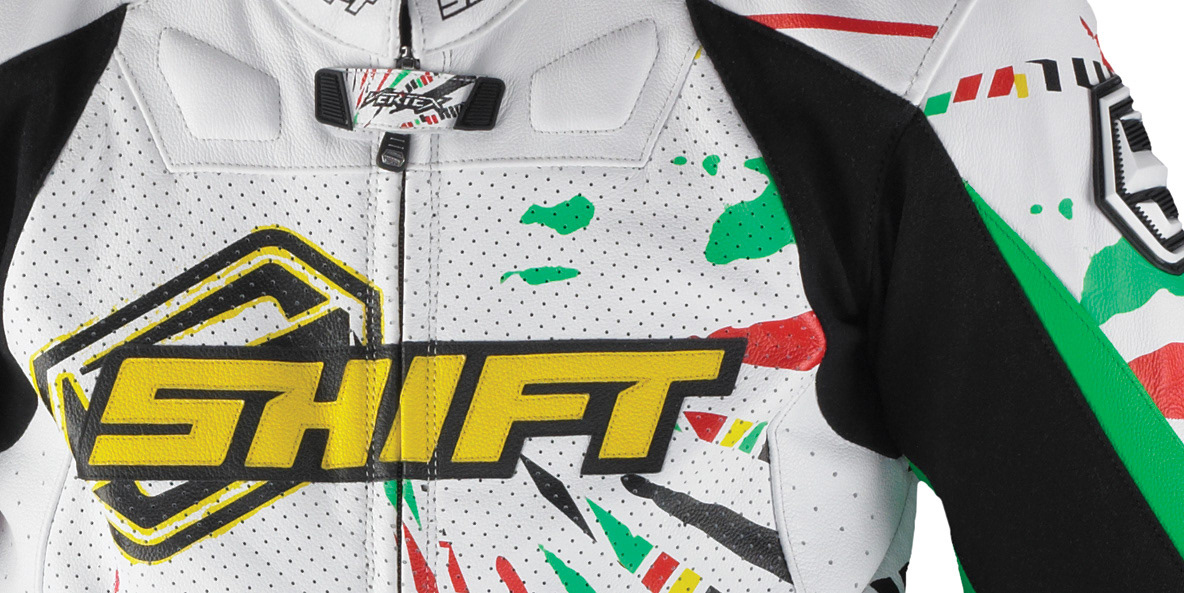
1) The majority of this market is very youthful. This means they are not only very open to new experiences, they expect them. They don’t want their dad’s gear. If a brand can not meet the expectation of the youth market they will be forever relegated to the older crowd. On the other hand, if a brand is legitimate with the youth market, they can create one subdued, probably black, color way for each product line that will still capture the older rider. 2) The sport is extremely fast paced, loud, and dangerous – the colors should be a reflection of that experience. 3) The brand has zero equity in any color. To do so would be too restrictive for this industry which is built on fast-paced change. Their corporate colors are literally black and white though they are willing to use whatever colors best suit a given color way. 4) There exists a non-traditional color hierarchy in this market. Loud colors need to be backed up by speed and speed comes with repetition and money. Beginners on cheaper bikes will spend less on their gear. Their objective is to fit in. Fast riders feel the need to look the part.The price and look of their gear is a reflection of their speed and commitment.
PERSONAL WATERCRAFT
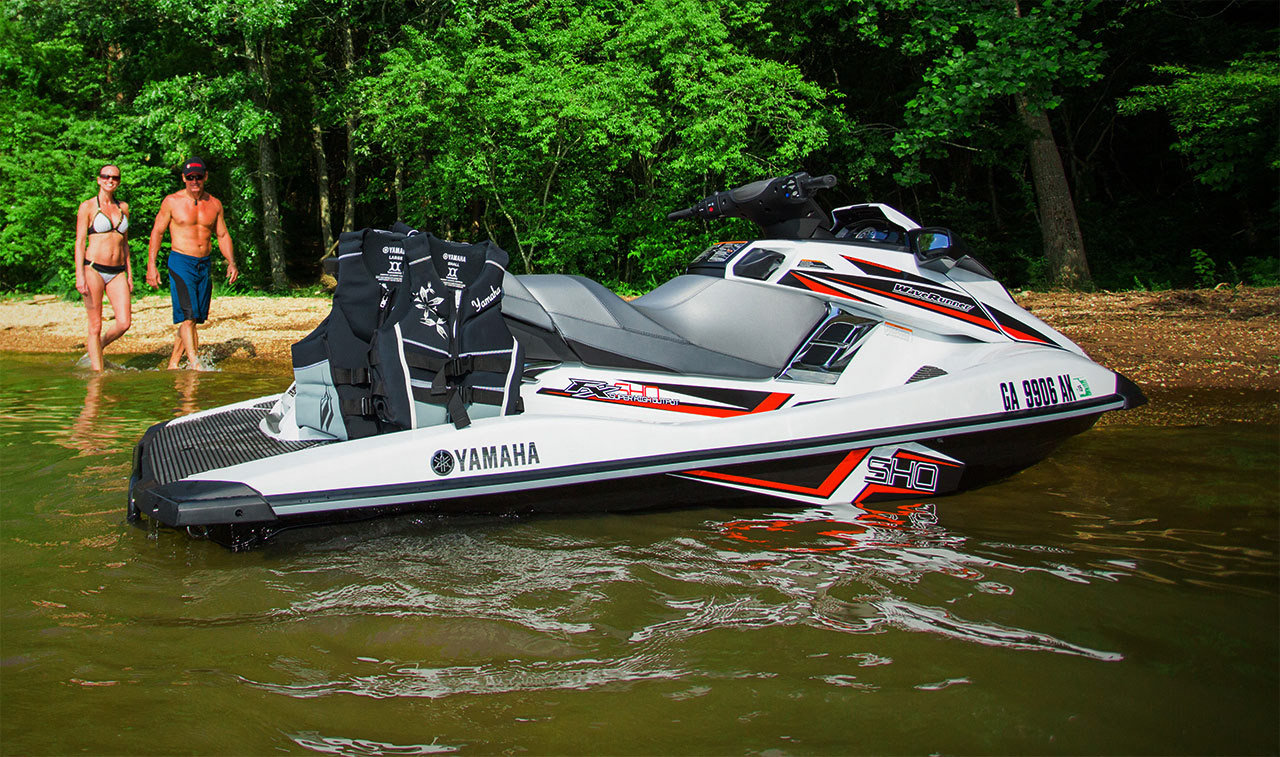
Buyers are typically in their mid- to late-thirties but the spectrum is really 20-50. This is so wide as to provide little input on its own other than to say you’re not designing for children or the elderly. 2) Like MX, this is a sports & leisure type product. There is no desire for muted colors or tones. The colors need to excite on the appropriate scale. 3) My client, Yamaha, is extremely invested in a particular color. There must be at least one color way of each product in Reflex Blue. If it is a motorcycle (MX in particular) or watercraft and its blue you can be pretty sure it is a Yamaha. In most cases that leaves one opportunity to pick another color for your palette. Since Kawasaki owns green and there is no desire for confusion by either, you can rule that one out. Though less tangible, but no less important, Yamaha’s reputation is built on superior engineering. Their sales tools are tech specs and reliability and that is ingrained in their culture. They will not be setting trends in the choice of color you can be assured of its quality and constancy. Color choices need to reinforce this image. They can not be perceived as temporary or cheap. This is in direct contrast to their main competitor, Sea-Doo. Not that Sea-Doo sets out to cultivate a cheap look either, but they don’t mind taking the risk if the reward is a more exciting image. 4) Hierarchy is largely conventional for these products. They market them as Performance, Luxury, and Versatility, though its actually more of a mid- high- and low-end spectrum with Race as a subset of Performance. On a low-to-high end scale you take more-to-fewer risks. Contrast is increasingly subdued in both hue and quantity as price increases. There is also an overlap with Environment. One level is more likely to be towed behind a lifted Ram, the other behind a Winnebago. Each customer has a different expectation of color as well as experience.
UNDISCLOSED PROJECT
I am currently working on a project with only demographics and environment to pull from. So in each case I dig deeper to flush out the information you need. I know from the demographic research that this consumer is more likely to take risks, though this is generally true of any product aimed squarely at early adopters. I also know what products from other industries they are more likely to associate with. This creates both a form and color language of its own. The colors should be within the spectrum that the customer is accustomed to, but still different enough to establish the product as its own. It is at once familiar and unique.