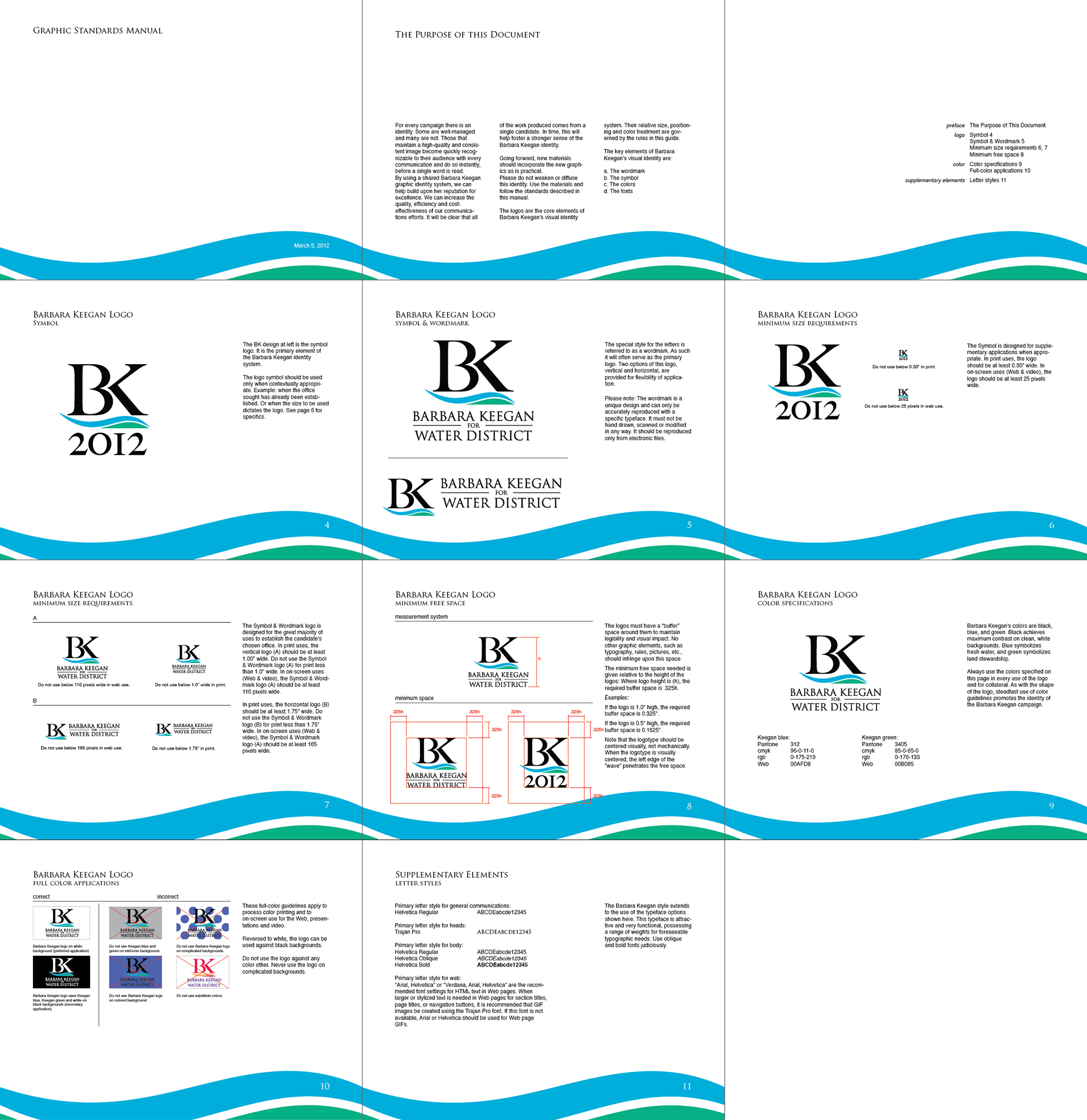
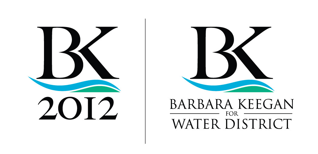
Above we have the campaign logo for Santa Clara Valley Water District candidate Barbara Keegan. As the only woman in the race Ms. Keegan wanted a logo that looked refined, somewhat feminine, and showed her concern for the vital resources she’s trying to protect. I designed these logos as well as a graphic standards manual to establish her brand and communicate her values quickly, effectively, and memorably. The logo font is based on Caslon letterforms which were heavily modified. Water and earth elements were added to convey her stewardship of resources. Trajan (yes, “the movie font”) was used to convey a sense of authority. The graphic standards manual comprehensively directs any future uses of the logo to ensure consistency and maximum impact in any medium. I had the good fortune of producing this work for a highly qualified candidate who, while being heavily outspent, won her race with a 24 point margin.