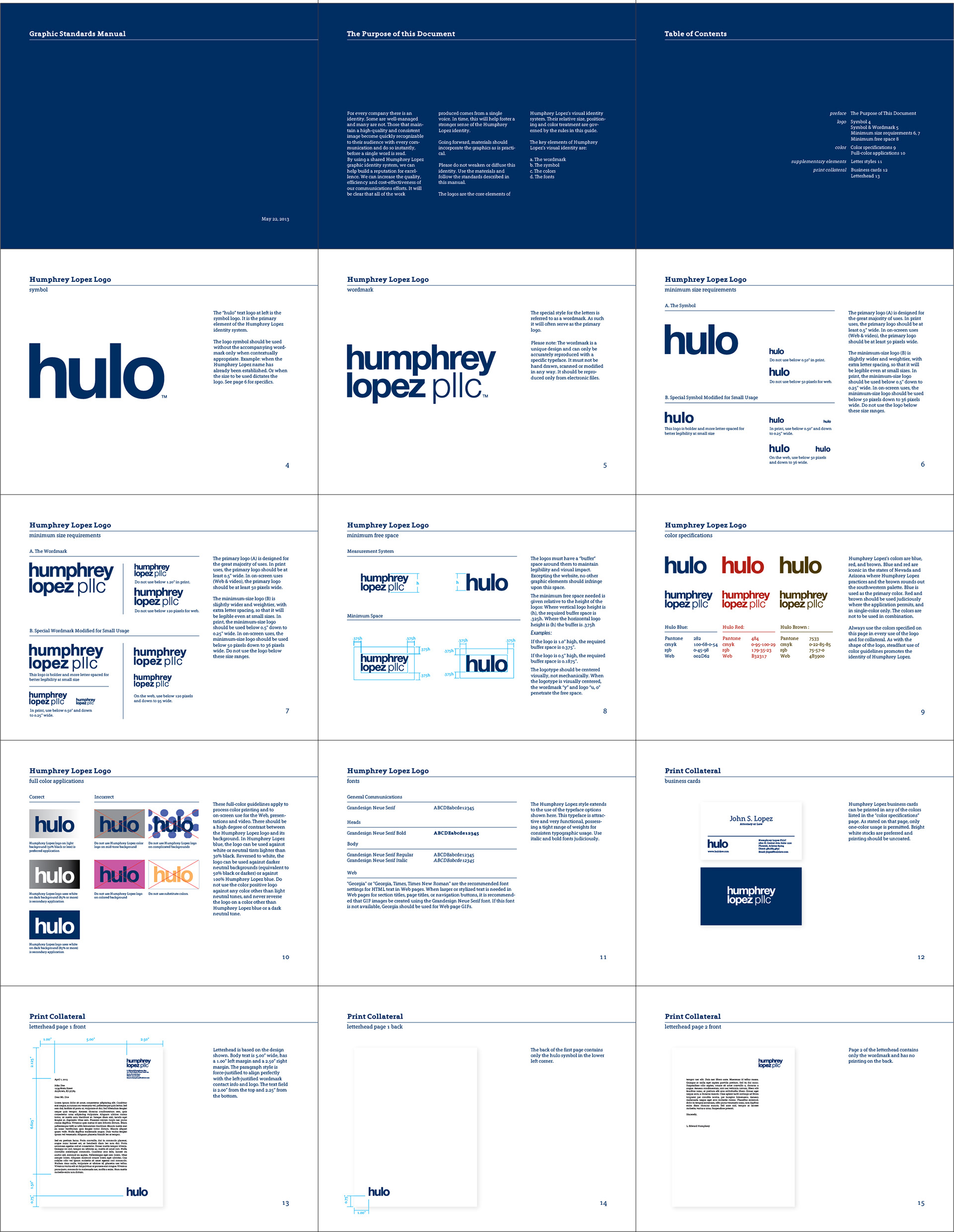
The law firm of Humphrey Lopez came to me with the thought that they could represent represent themselves in a fresh way for what is an ultra conservative industry. There are some regulations that we had to be careful to adhere to. For one, you have to use the names of the firm’s principals. You are also not permitted to use a symbol as a logo. A wordmark however is not expressly prohibited.
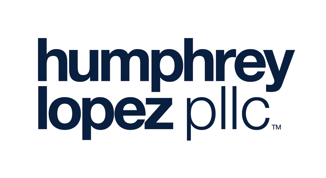
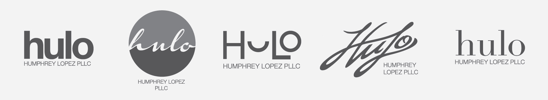
The primary wordmark is the full spelling of the company name. This establishes their identity so less formal applications can appear later in various media. The wordmark breaks with convention on a couple different levels and for one important reason. It is a sans serif font which helps separated them from the sea of Times New Roman competitors. It is also all lower case. Humphrey Lopez specializes in creating solutions that work for both parties – they will get tough if that’s what’s needed – but they would much rather come to an agreement where both parties walk away as winners. As such, they wanted to look approachable, but not stuffy, professional, and definitely not like you might find on a bus stop billboard. This was achieved with meticulously alignment and kerning of a modern font in the Swiss tradition.
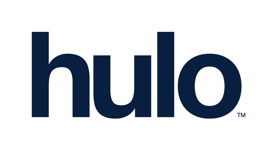
A contraction of their last names and part of their web address, “hulo” is used strictly as a secondary mark. It generally appears smaller in size and after the primary wordmark has been established.
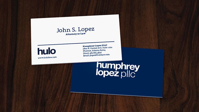
Business cards feature each partner’s name prominently on the front while the back features a color field and reversed primary wordmark.
Early concepts below show the range of concepts created for the client. From here we were able to zero in on the relative formality that best fit the business and best met the regulations on branding. The full business name is used as a placeholder at this point in the process.
While a dark palette was eventually decided upon, a flexible color range was also explored — one that reflected the heritage of the client’s locations of Arizona and Nevada

A corner stone of a solid brand identity is consistency in all applications. The Graphic Standards Manual helps ensure trust through consistency.