Central Valley San Jose Youth Soccer
As a long-time soccer coach for both of my kids' teams, I had a personal interest in the well being of the league. When another coach mentioned to me that the league was thinking of re-branding, I stepped up and offered my services. The league hadn't done anything to update their identity since the mid-eighties and it showed.
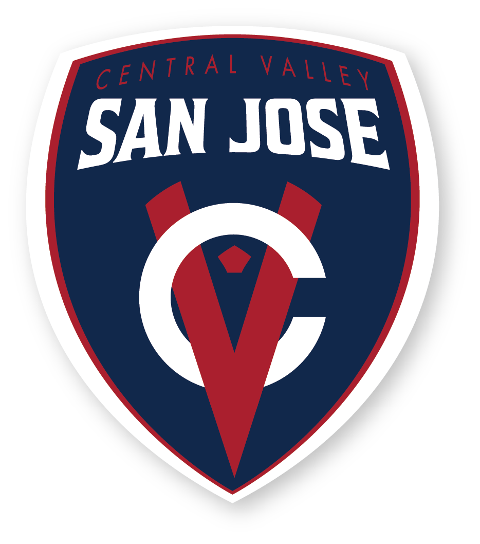
Shield Concepts
I often like to provide mild to wild concepts to find the limits of a client's comfort zone. The old logo was typical of what you would expect. The dominant feature was an Adidas Telstar soccer ball while the typography was Impact Italic. This is probably as basic and conservative as could be, however the soccer league was not. Having just separated from an extended partnership as a youth development pipeline with MLS side San Jose Earthquakes, CVSJ needed an identity that reflected their ability to serve recreational kids programming as well as high-quality training for aspiring players.

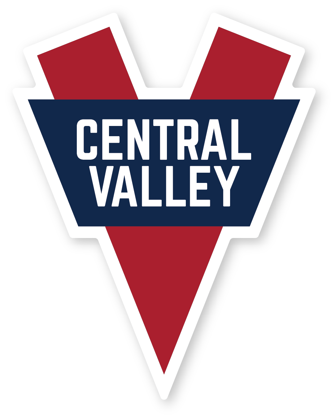
Shield design proposals
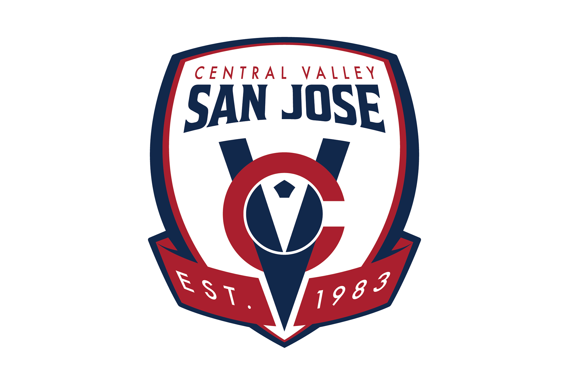
They had chosen the most conservative design, the one with the soccer ball. I had honestly chosen to include it so they could see just how antiquated the concept looked. To their credit however, they heeded my advice to push them out of their comfort zone and chose the interlocking "cv" in the shield. Concerned they were losing some of their heritage, they did have a request to add an element that honored their relatively long history in the sport. By cribbing the banner element from another concept and using the ''v" to slice it down the middle, I added the "EST. 1983" to the crest. This also helped to give the symbol more balance. The result was a better logo than any of the original proposals. When clients aren't overly proscriptive and designers are flexible, great things happen.
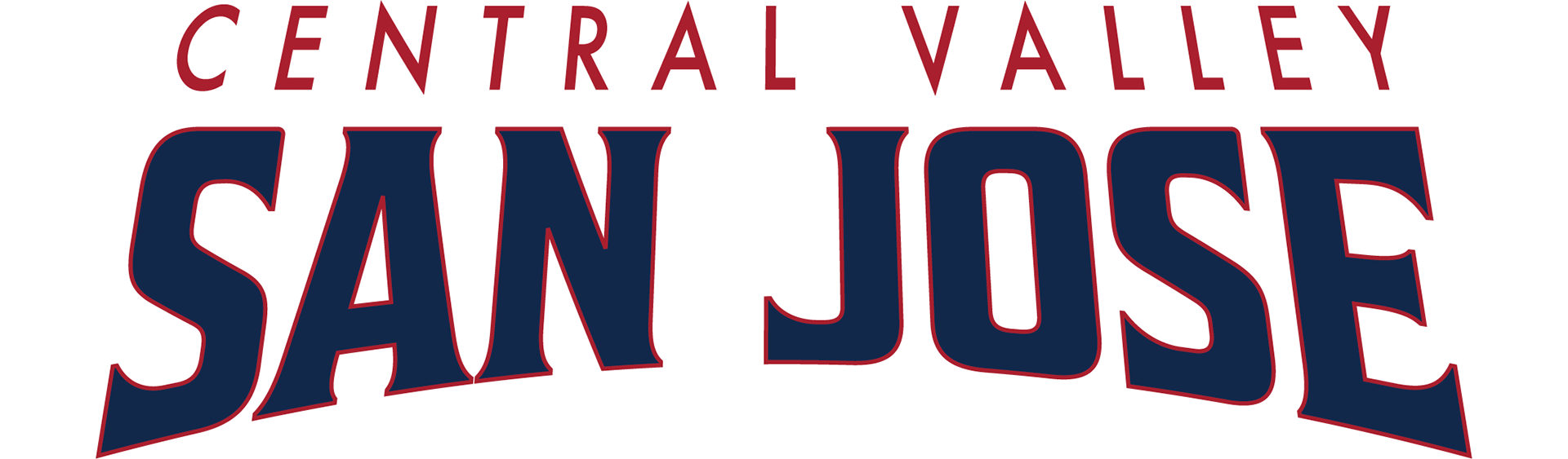
Logotype
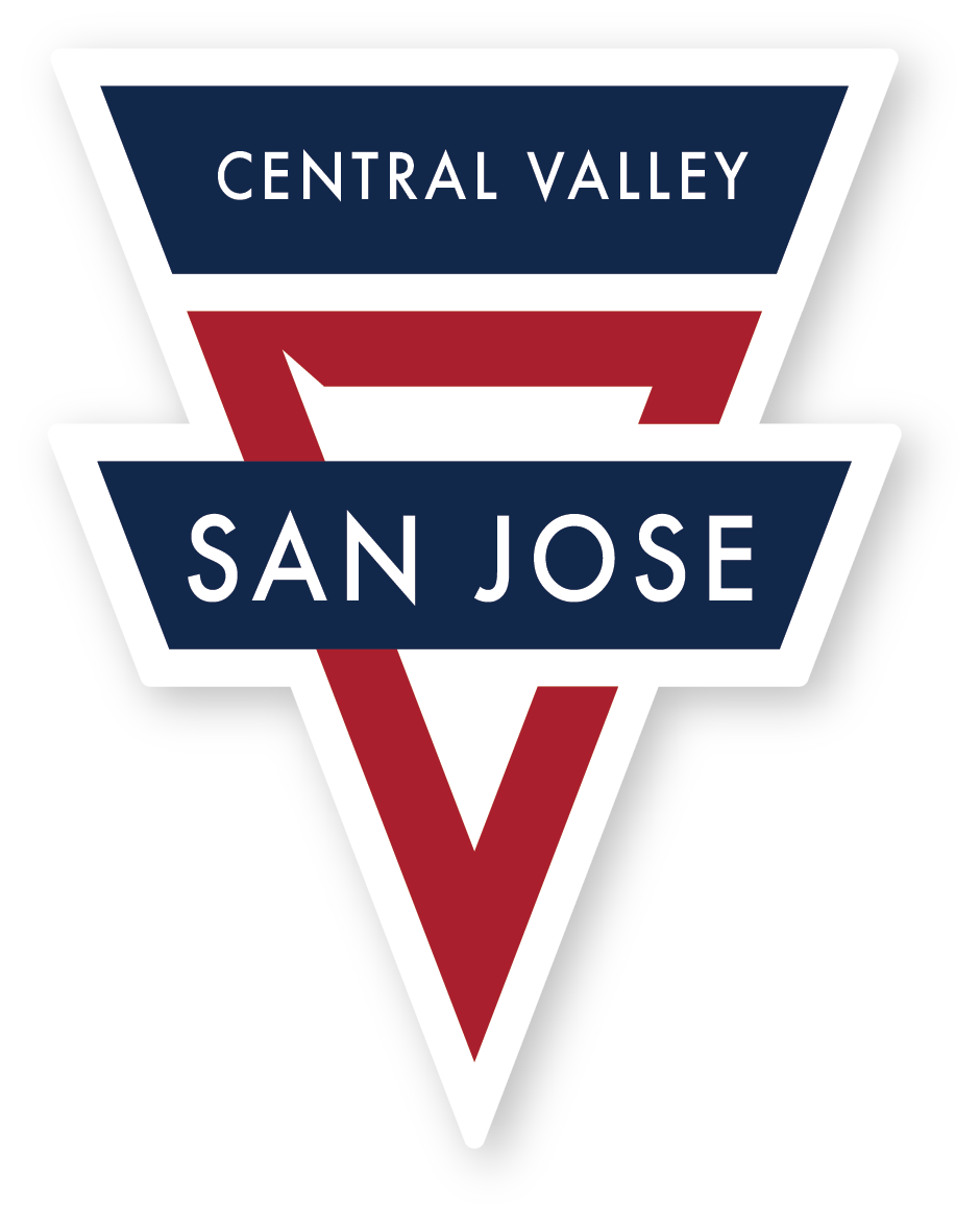
Pulled directly from the shield, the logotype is used where horizontal orientations are preferred. The league requested that "San Jose" be the dominant message, but they still wanted the heritage of "Central Valley" to remain. To fit the dynamic shape of the badge, the text is laid out in perspective. The arching bottom fits nicely into the badge, but also recalls the heritage of the league's former logotype which simply read "San Jose" and didn't seem to have any connection to the badge whatsoever.
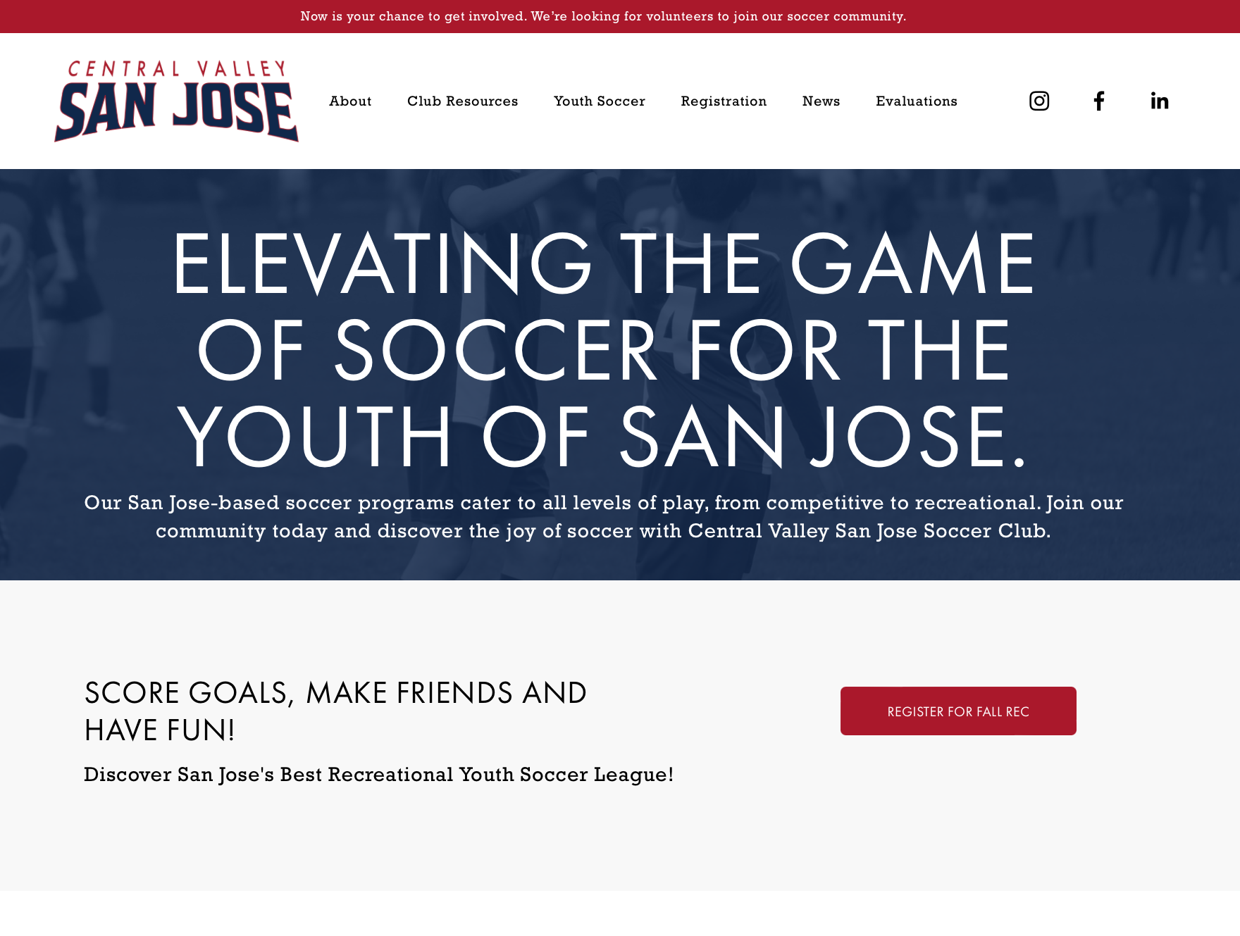
Videos are featured content on the website and play a prominent role in conveying information, but they can only do so much. More detailed information is presented in text and photos for each featured article on the site. Featured card images for each post are similar to the video cover images with reduced branding.
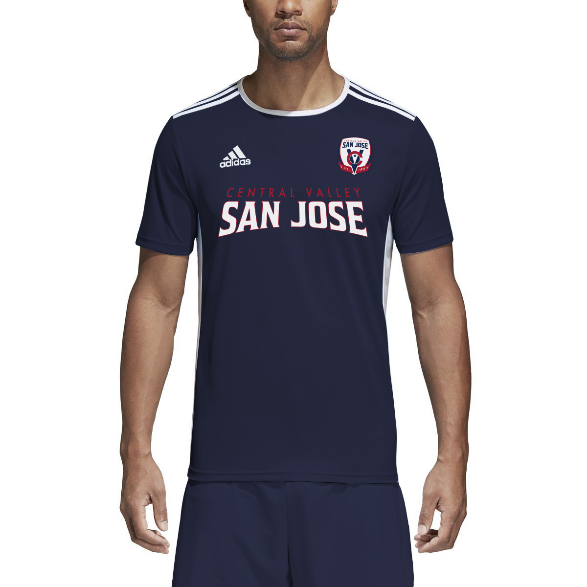
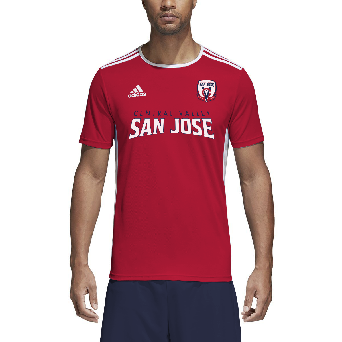
Collateral
Competitive soccer team uniforms employ the badge in the upper left chest and the logotype across the front.
Website