Humphrey Law
Back for his second business, this time flying solo, lawyer Ed Humphrey approached me to design his new identity. He was pleased with the "hulo" identity I had created prior and wanted the logotype to be similar, but this time to complement it with a symbol.

Logotype Studies
The after going for a pure logotype in his previous business, the client wanted to explore symbols as well. This is not something often done for law firms, so a cautious approach was needed, something that could be justified as simply using the company initials in a creative way. To achieve this, I investigated using the letters H and L as negative space in more and less abstract, somewhat architectural ways. Ed did want continuity from his previous logo, so Helvetica Neue was retained.


As much as I appreciated the more abstract golden section proportioned second symbol concept, that was a bridge too far for the client. He made the solid choice to proceed with the ore readable first concept with the overlapping negative space letters.
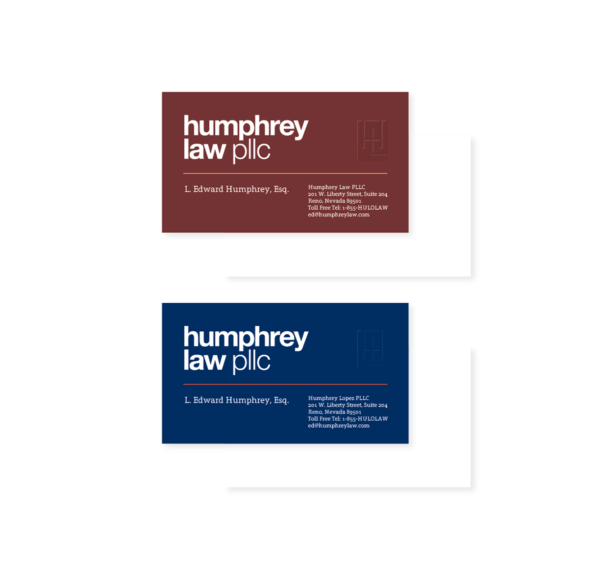
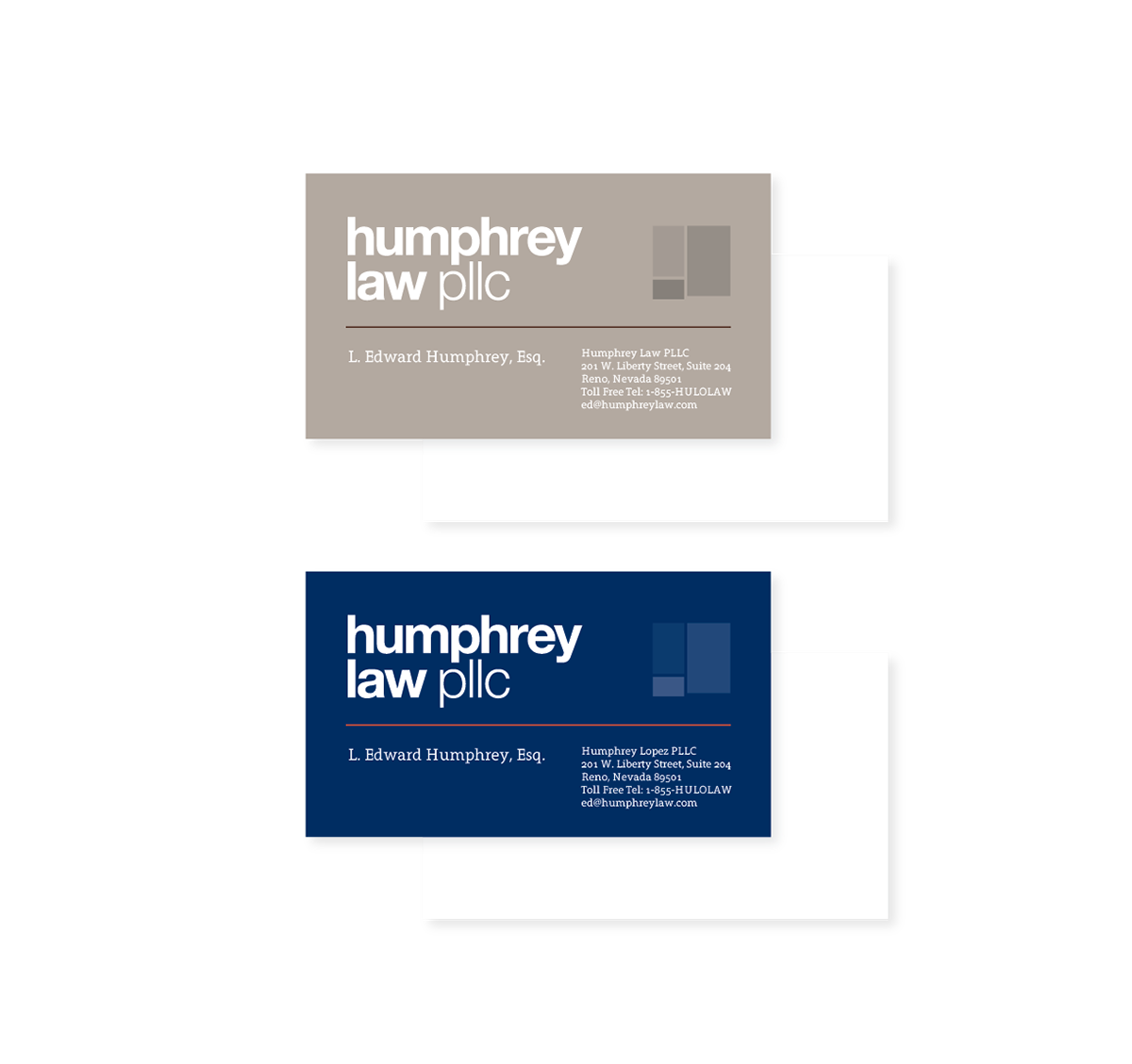
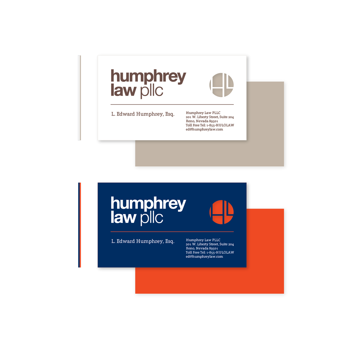
Color Studies
I prepared each concept along with business card compositions with proposed color combinations and print techniques such as embossed, plain, and layered. Type styles were carried over from the earlier business, so Grandesign Neue Serif was employed. The navy/orange card on the lower left was chosen.