Lawyer Ed Humphrey has been a loyal C Davis Designs client for a decade. During this span, he has worked in partnerships and gone solo. I am honored to have earned Ed's trust and proud to present his latest graphic identity.
Logotype Studies
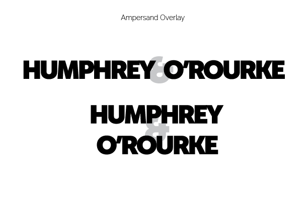
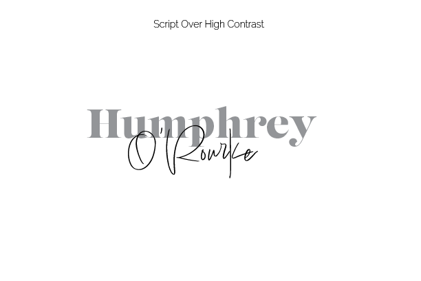
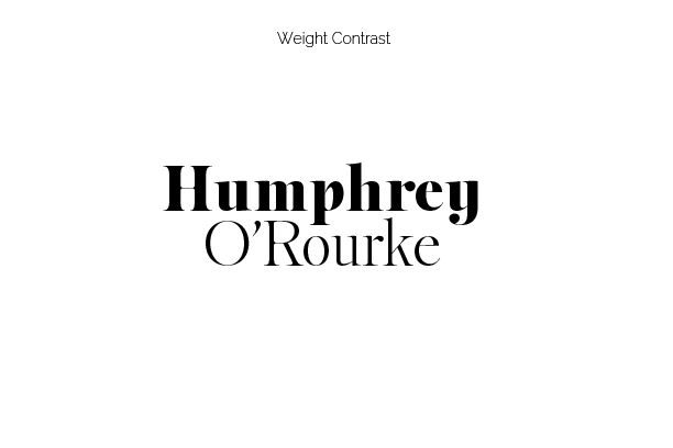
Ed and his business partner Patrick wanted clients to know that they are a team that can deliver expert legal services in a wide variety of specialties. They were open to using other characters to help identify their partnership. It was a good thing they were, because it was important that people didn't perceive the firm to be a single person with the first name Humphrey. I presented Ed and Patrick with six unique designs in grayscale with to avoid colors from clouding any judgment regarding form. All concepts were designed with the goal of conveying either teamwork by linking the two names or emphasizing their differences by using fonts with contrasting personalities.
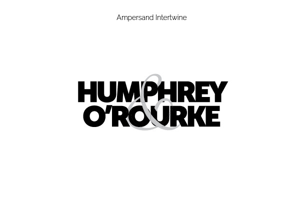
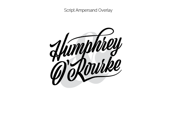
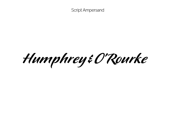
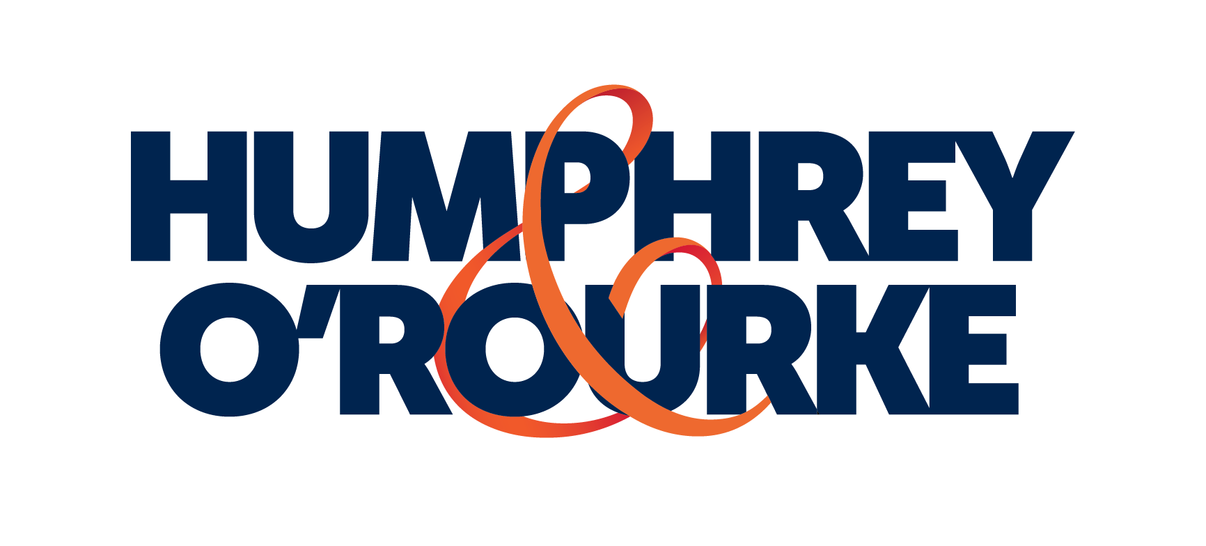
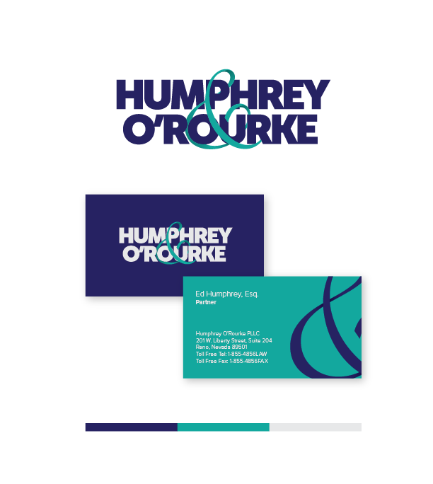
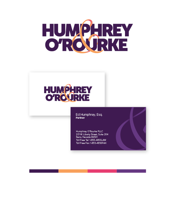
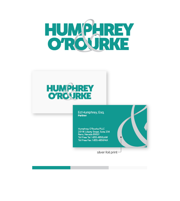
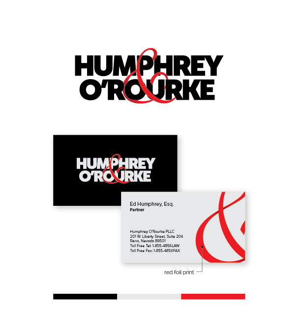
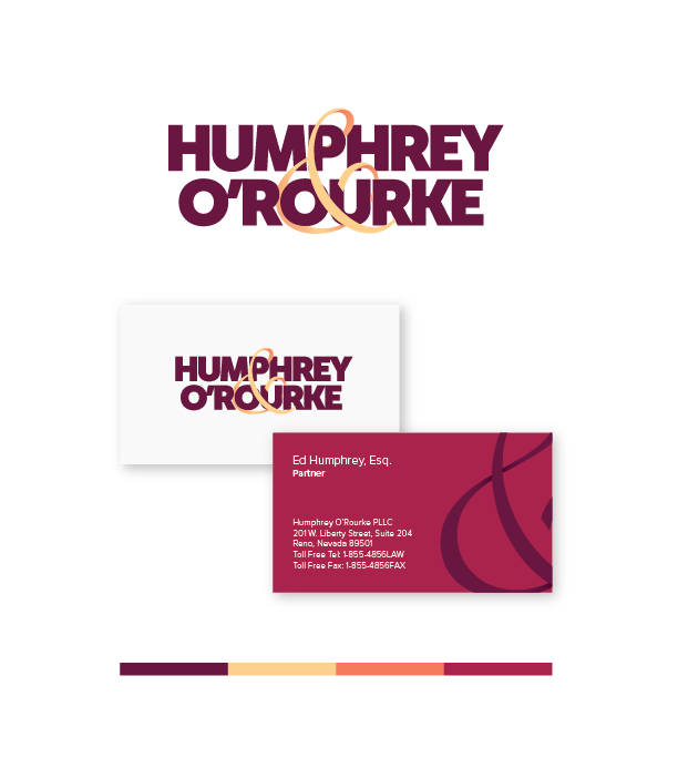
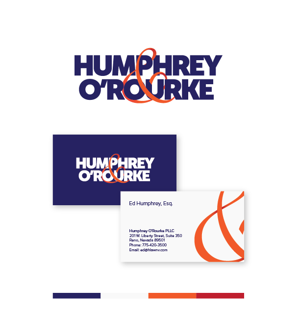
As we can tell, Ed and Patrick chose the "Ampersand Intertwine" concept. This presents their names in bold, readable text and creates unity by wrapping their surnames in an ampersand ribbon. From there the letterforms were further massaged and a gradient was added to the ampersand to give it depth ahead of the color study.
Color Studies
In order to maintain readability in both positive and negative versions, the correct amount of contrast in color values was critical. It was important that whether the background was dark or light, that the clients' surnames were easily read and the most dominant elements. Navy/Orange certainly fit that bill and it didn't hurt that Ed's two previous identities were also blue. The clients also requested Navy/Crimson. I presented them with the option, but guided them back to their other choice of Navy/Orange due to the legibility issue of two dark hues together. I prefer to present these studies in context so my clients and I can see the real world application of our decisions.
Graphic Standards Manual
Even the best logos can quickly turn into a mess if it is implemented poorly. For that reason, I always include a Graphic Standards Manual. Potential clients will often tell me they only need a logo. If I can not convince them that their implementation of it is more important than the logo itself I will not take the job. It is a good indication we are not a good fit for one another. See the attached file for the guide the client was provided.