The team at the start up management consultancy Lucid Advisors was referred to me by a past client. Together we worked to create the logotype and website that they could leverage to gain clients.

Logotype Studies
The client came to me while the project was in its infancy—before the company had even had a name. When they decided on "Lucid" as the name, it struck me as an excellent choice both in respect to its meaning and its brevity. We would definitely need to distinguish it from the electric car company of the same name. Lucid Motors also happens to be a Bay Area company like Lucid Advisors. To achieve this, any logotype we chose needed to avoid the all caps and wide letter spacing chosen by the car company.
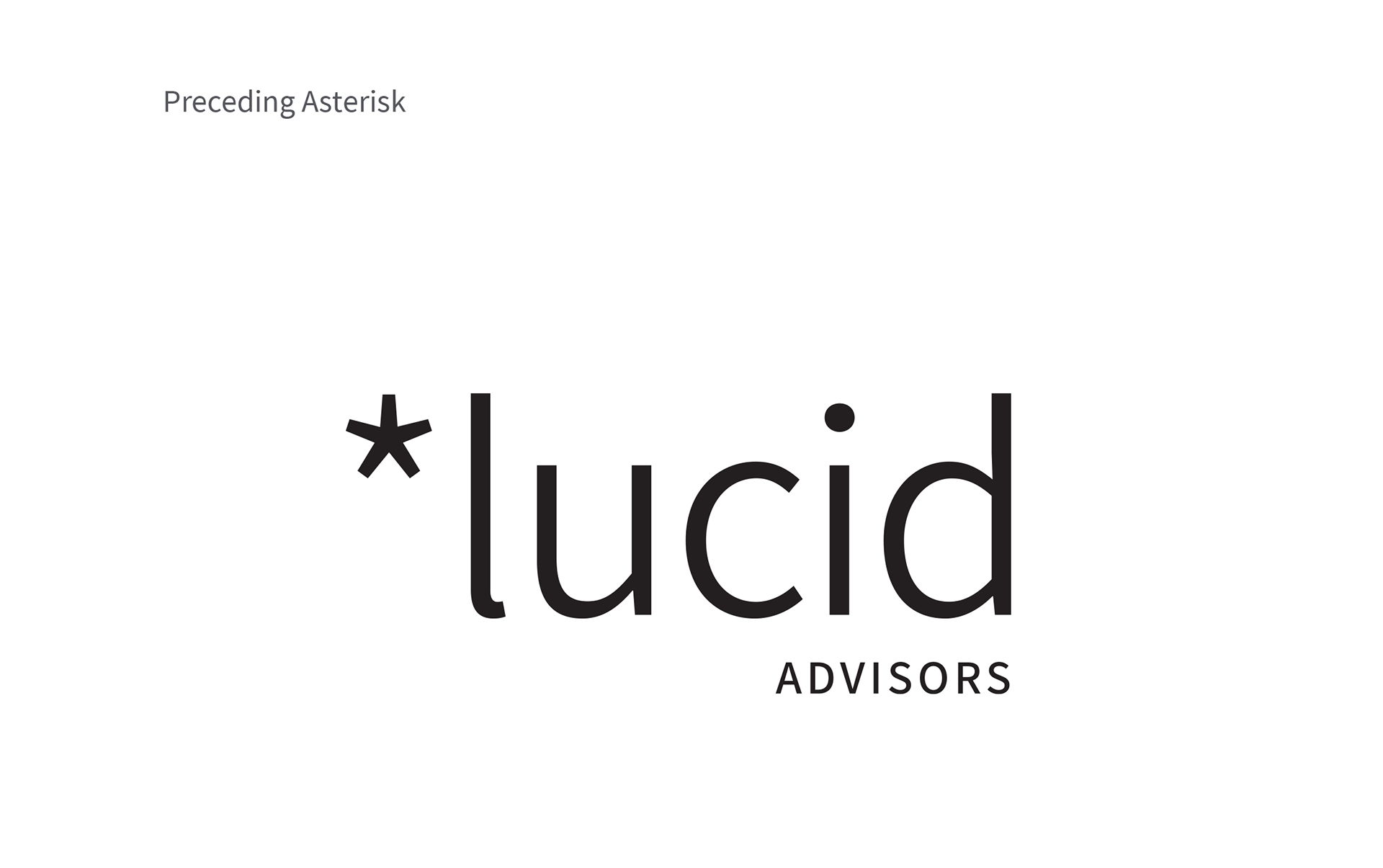
Use a symbol to convey the literary meaning; bright or luminous. Asterisk is both symbol and typeface, can be seen as a star and connote something of special interest. I envision in print and electronic applications a gradient originating at the asterisk for either the logotype itself or its background.

Again trading on the literary meaning of the word, the dot in the “i” is r eplaced with a stylized asterisk that more literally resembles a star, rotated to point up and to the right and with a lighter value.
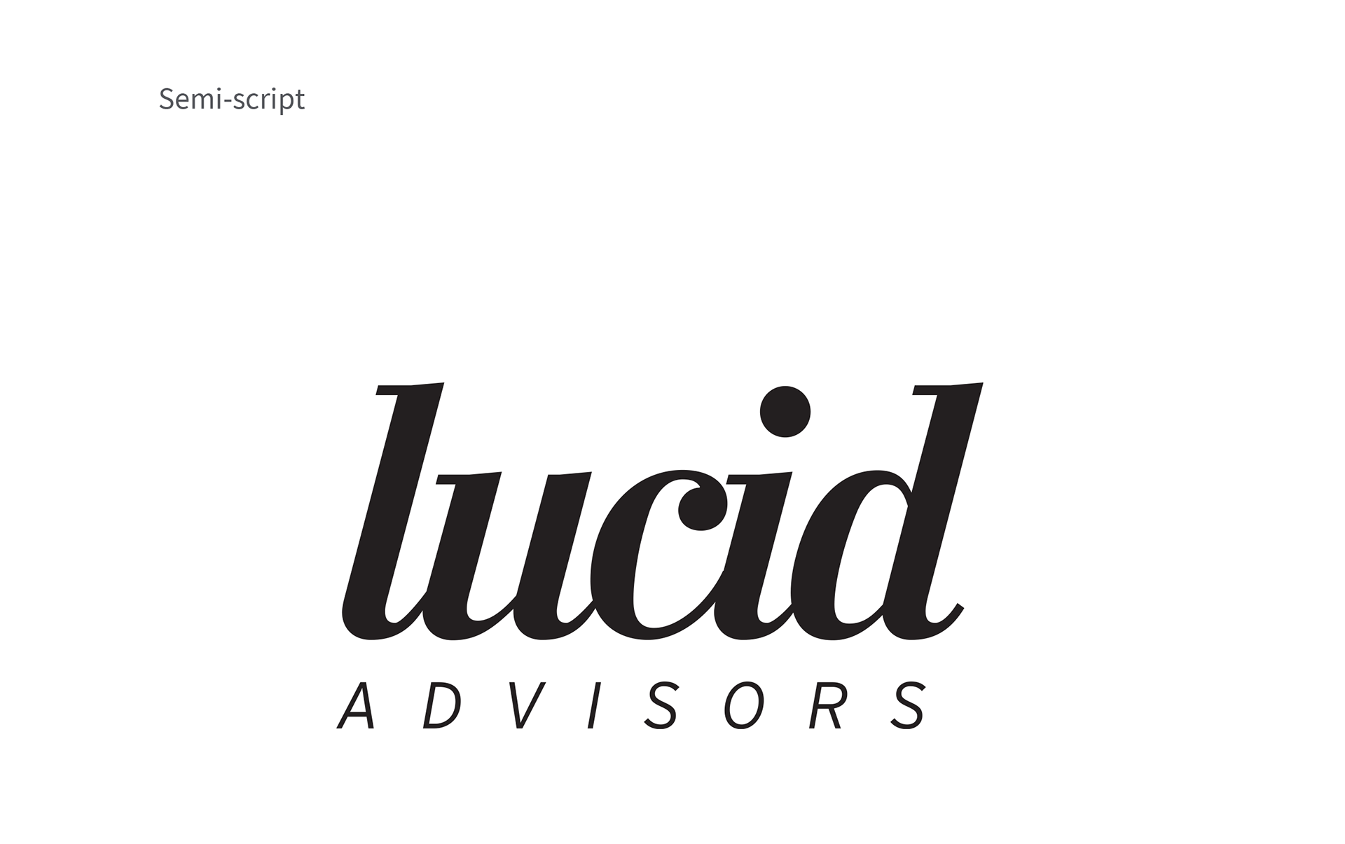
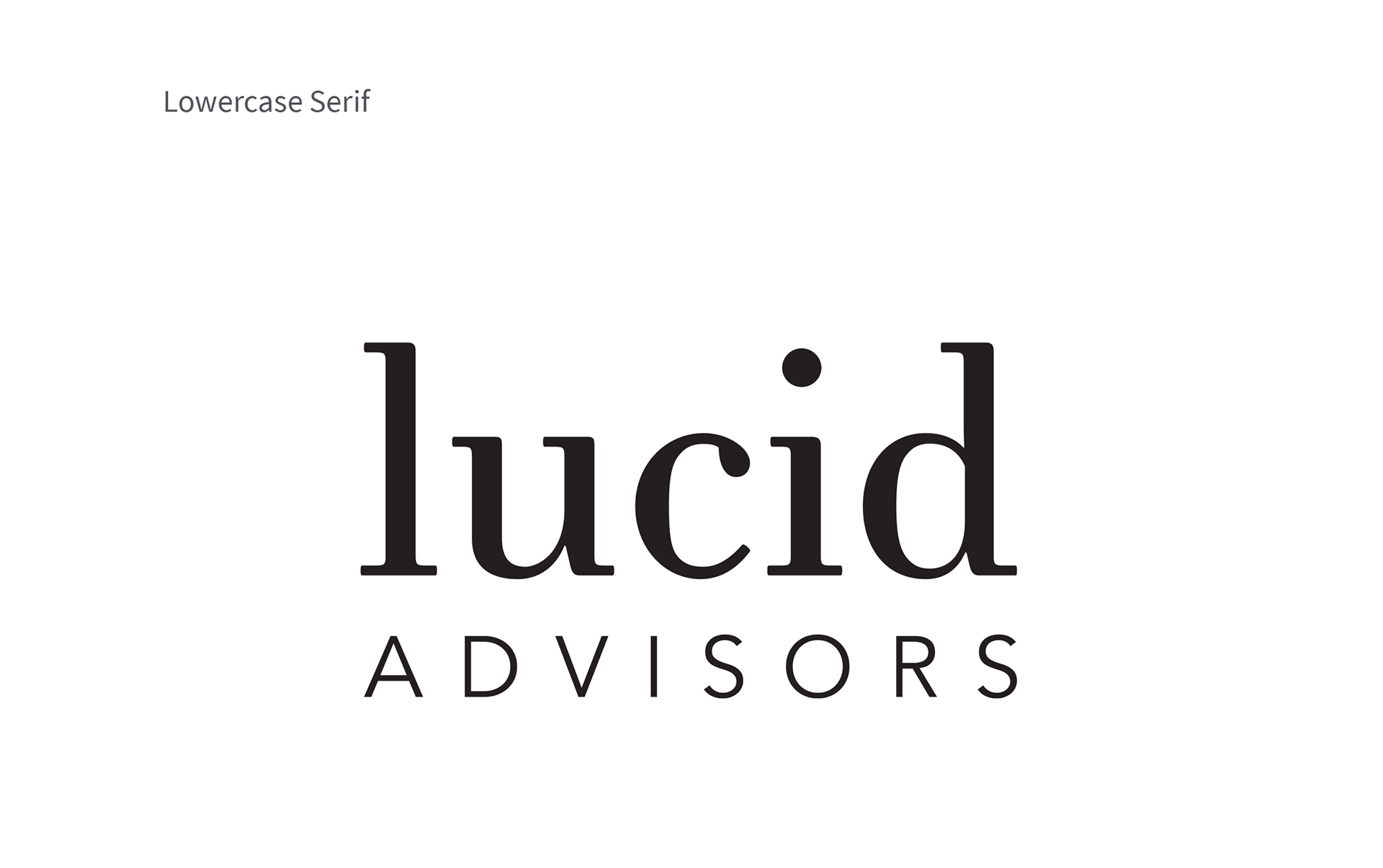
Friendly and clean serif typeface rendered in lowercase in stark contrast to Lucid Motors’ all caps, highly geometric and widely spaced lettering. The dot in the “i” could be the center of a circular gradient, similar in theory to the previous concepts.

Use rectilinear typeface to homogenize the letter forms to create uniform spacing between each. Maintain proportions throughout, ex. the height-to-width proportions of the letter “L” is the same as the width-toheight proportions of the word “LUCID”.
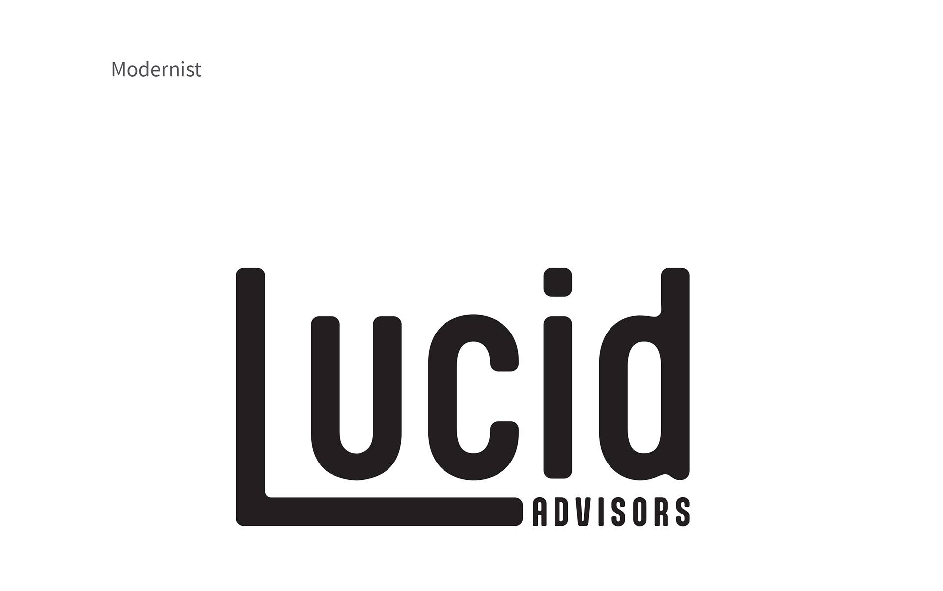
Reduce the L-U gap by using the L as an underline and “ advisors” as a continuation of that, creating a modernist feel.
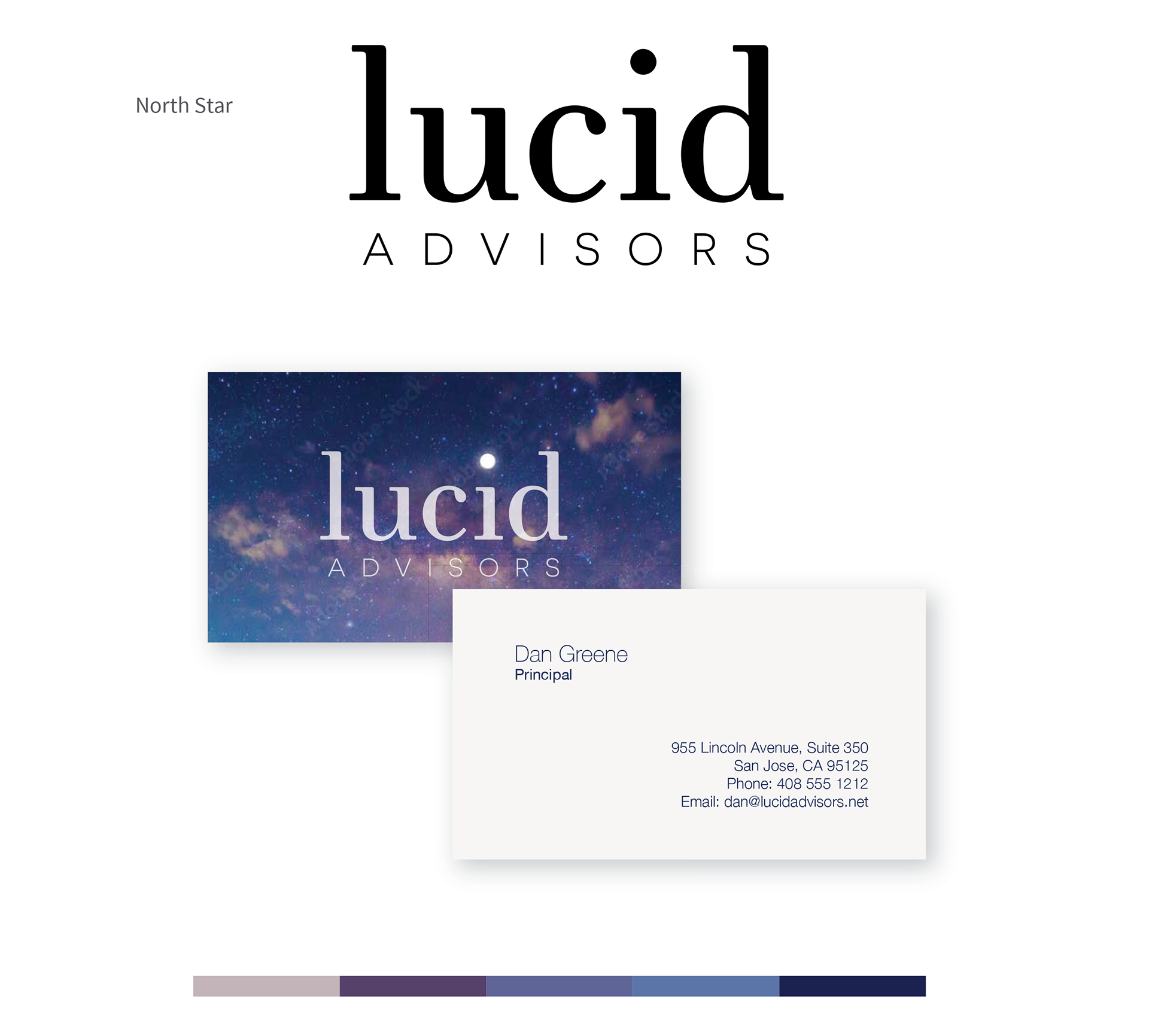
As you can see, the germ of the final artwork was using the dot of the "i" as a beacon of light. The thought process behind this was the secondary definition of the word; "bright and luminous."
Color Studies
As I often do, I created business cards as a test case for color variations. In most concepts the dot of the "i" is illuminated in some fashion, whether it is by color or by a special technique such as a hole, spot gloss, or foil.
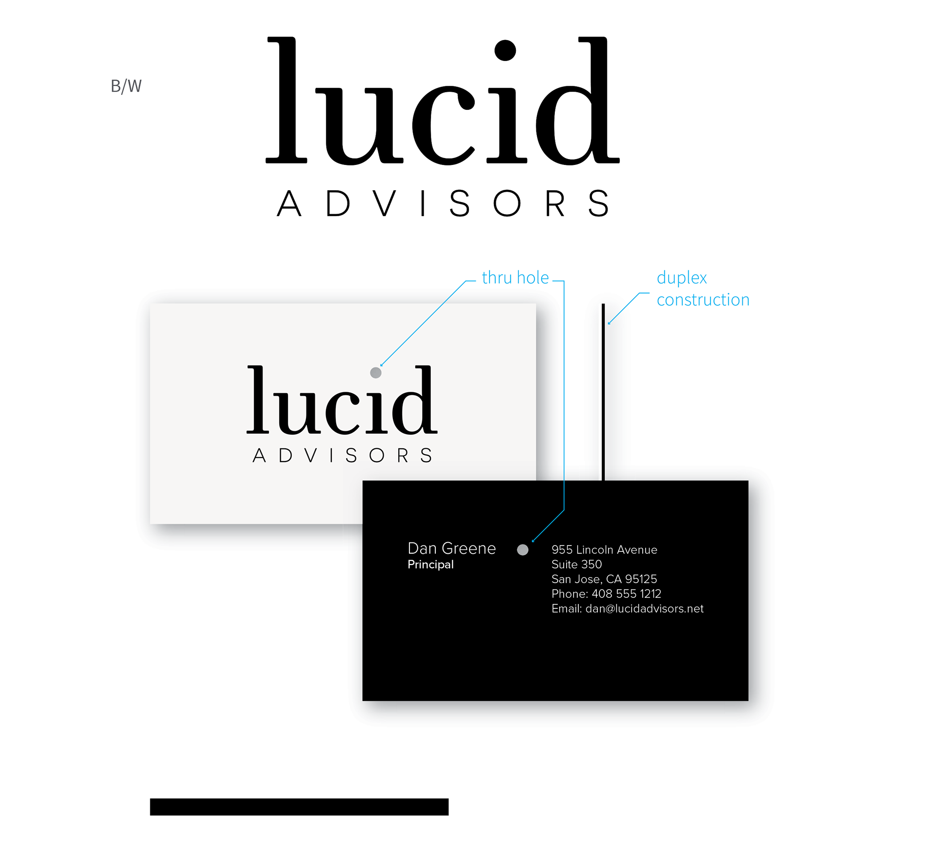
Maximum contrast, with rich materials and novel detail. This card uses two sheets of colored paper bonded together with the dot of the “i” drilled out, allowing light to shine through. Alternately, the dot could be printed in spot gloss on one or both sides. F ont: Proxima Nova
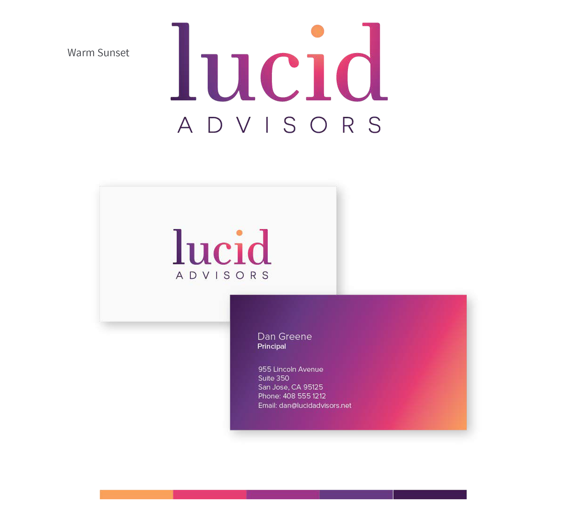
Applying the colors found in a sunset to a gradient to both the logotype and the background of the card. Centering the light around the dot creates a sun-like element. Clear varnish applied to back of card to protect color from wearing off when handled, otherwise conventional techniques. Font: Proxima Nova

Silver foil over light sky blue combines a low color contrast with a high finish/texture contrast to create a sophisticated, elevated, and airy feel. A punched hole only through the blue surface creates a bright white reveal. Alternately the dot could be either foil or white print. Other applications would use the light blue gradient shown at top. Fonts: Roboto Light, Roboto Medium
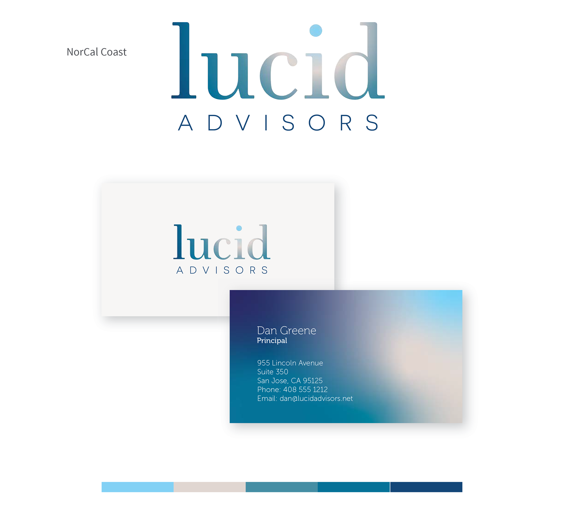
Colors sourced directly from a photo of a Northern California coastal cliff, this color combination captures sky, sand, and waters of various depths. Fonts: Museo 300, Museo Sans 100
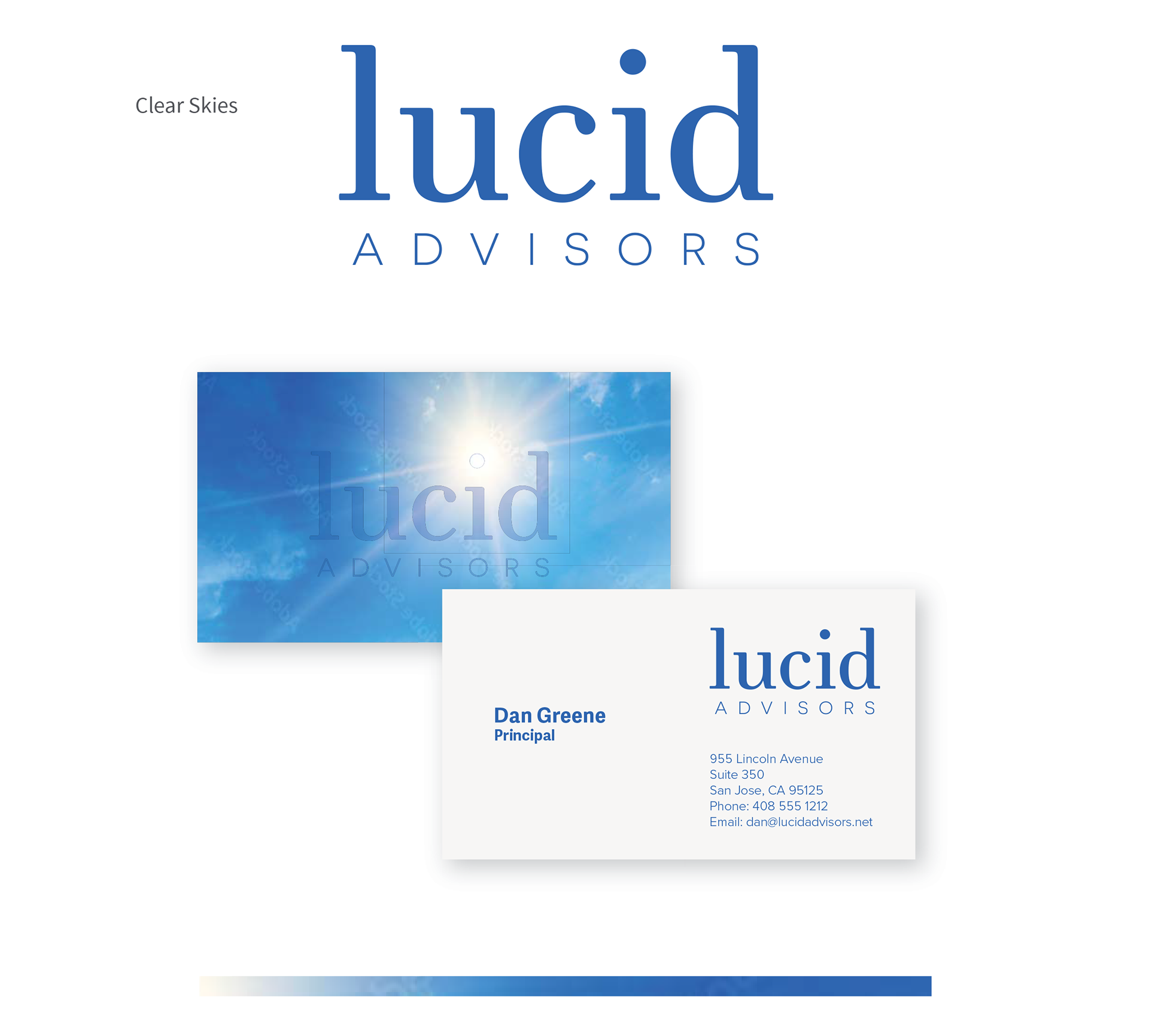
Using a photo as a background and a printing technique known as spot gloss, this card uses a bit of subtlety on the back. Spot gloss is clear shiny print that adds a slight amount of darkness over the print surface. The dot of the i is placed directly over the sun.