The San José Sharks hockey team just released their "Evolve" uniform update on September 14th. Paying homage to the inaugural 1991-92 season's kit, the classic waist striping returns. Subtle additions include an embossed wave pattern in the waist's teal section and, and though dropped from the exterior of the uniform, an orange inner collar panel. But the thing you'll most notice is the massive amount of teal in the composition. Did they get it right?
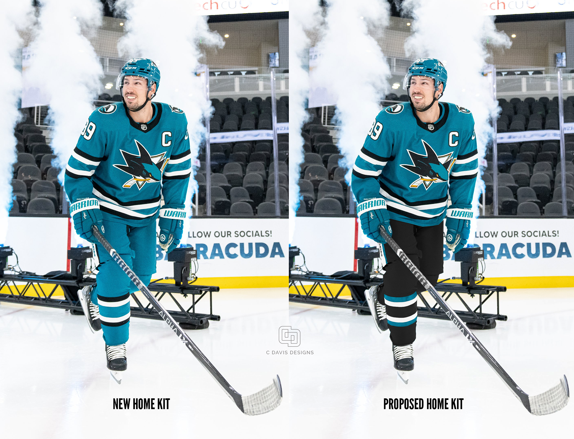
Often times, a single color applied to an entire uniform can look a bit more like pajamas than is desired. This is particularly true when a sport's uniform is head-to-toe. For instance, with a simple break at the knee, soccer uniforms do not have to contend with this issue. I applaud the Sharks for stepping out of the all too familiar hockey rhythm of color/black/color when it comes to the sweater, shorts, and socks. But what if we consider another option; color/black/black?
Color balance is fun, but let's also look at some of the details of the uniform.
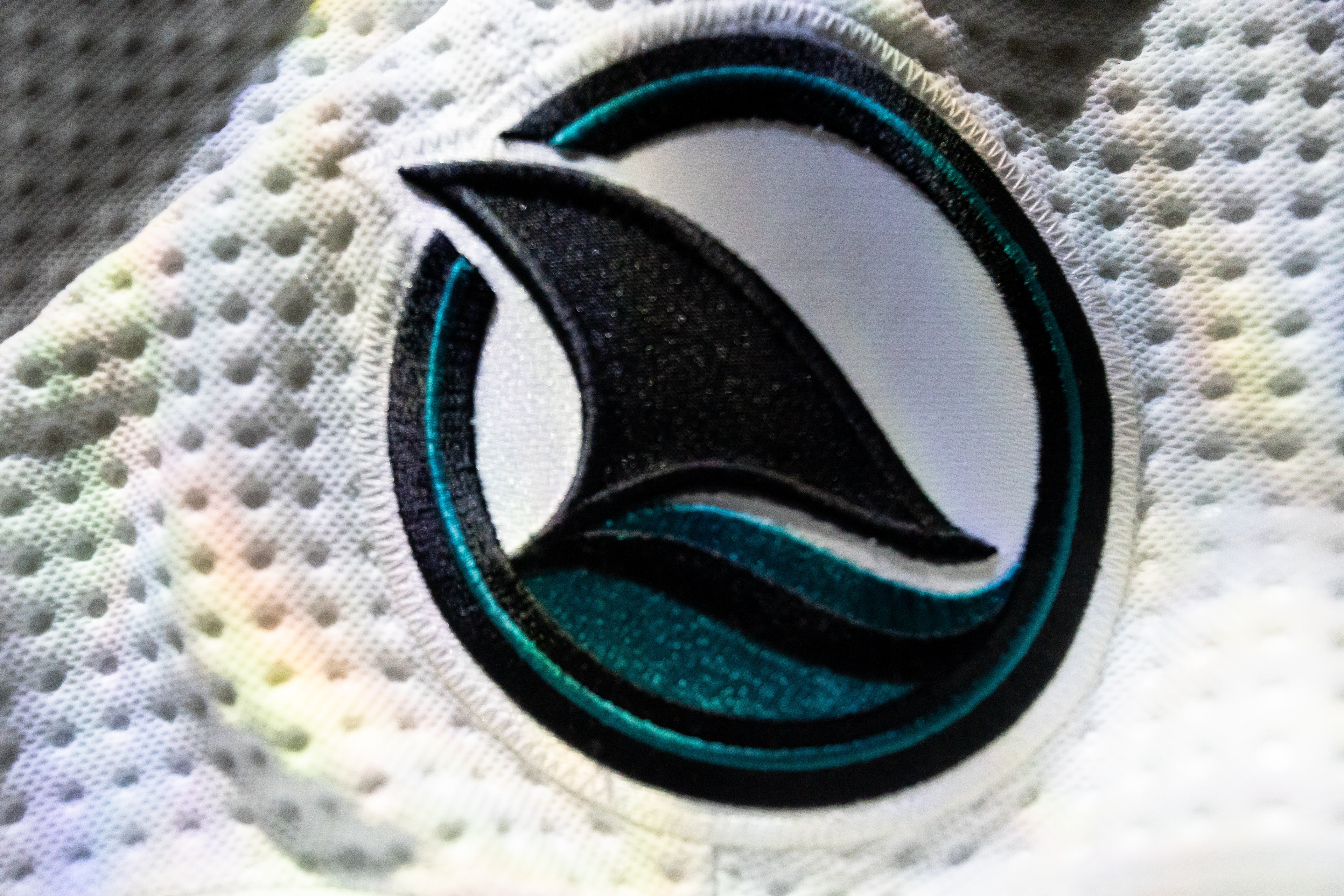
Secondary/Shoulder Logo
Keeping up with the uniform's clean lines, comes a simplified and much bolder shoulder logo depicting the dorsal fin slicing through the wave. Much like its predecessor, this shark is swimming to our right. Now have a look at the image at the top of the page. On the right sleeve it swims forward, on the left it swims backwards. Being that sharks are known for their prowess in attack rather than retreat, should the right patch be mirrored so they are always on the offensive? I think so.
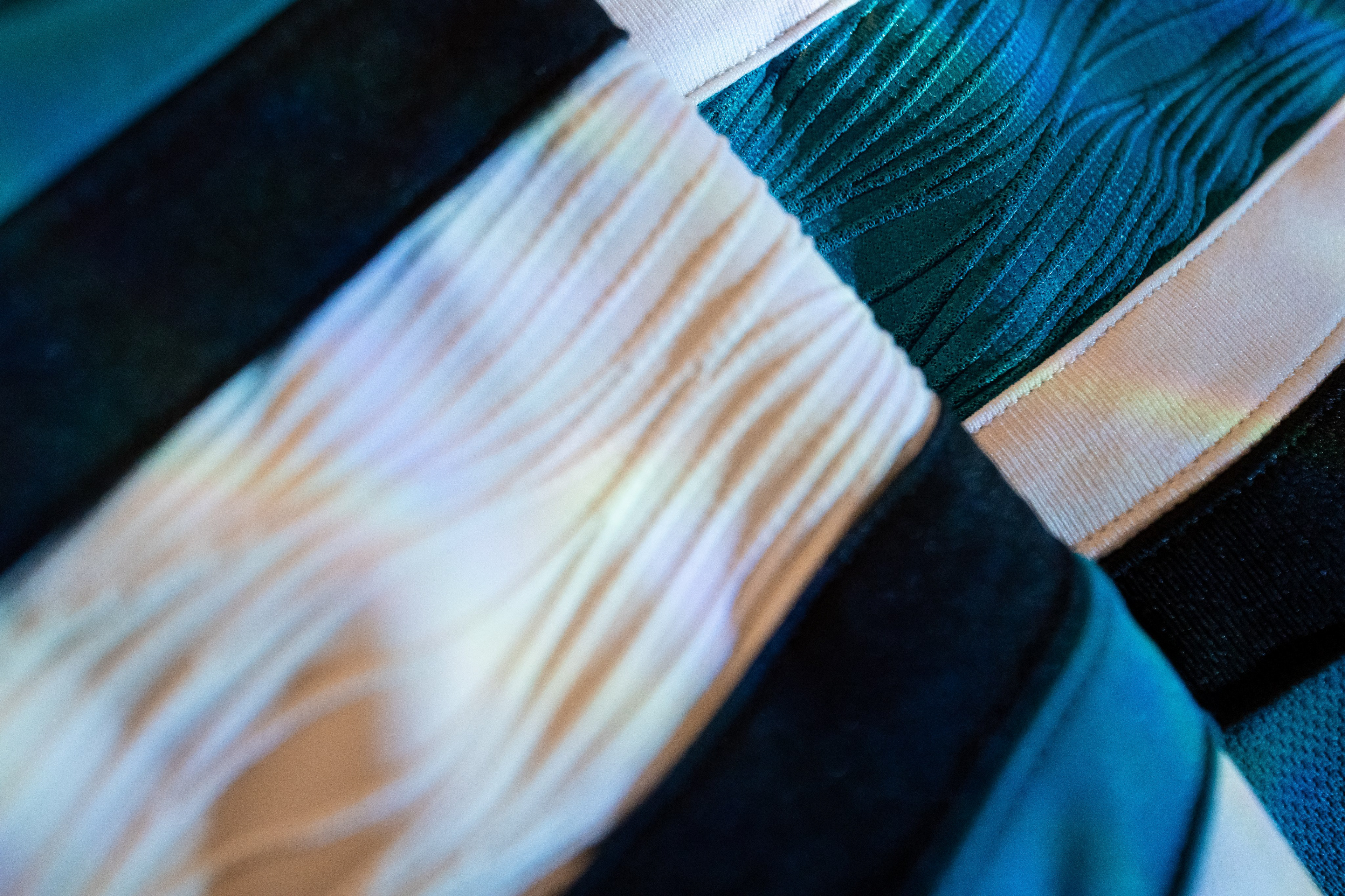
Wave Embossing
Love it, no notes! A well-executed maneuver by the design team in keeping with much of the wave-related graphics the team employs.