
James Lindsay of Sierra View Partners came to me the way the majority of my clients do--word of mouth from prior clients. One of the best parts about referred clients is that they are almost always great to work with and James was no exception.
Logotype Studies
Sierra View was a new business, as many of my clients are, so we were starting from scratch. That said, the name was already chosen and fortunately for me, it lends itself to a lot of visual options. Below are some of the directions I explored before we settled on the final graphic.
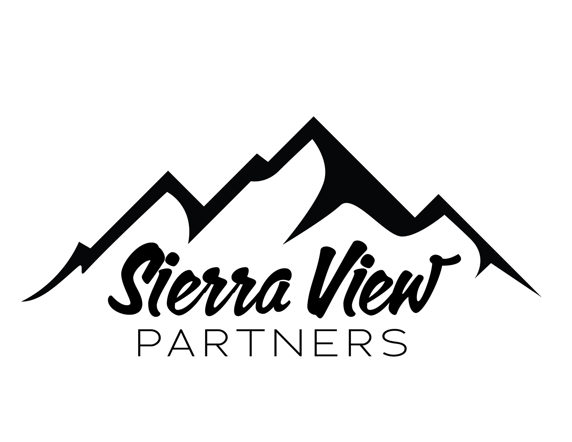
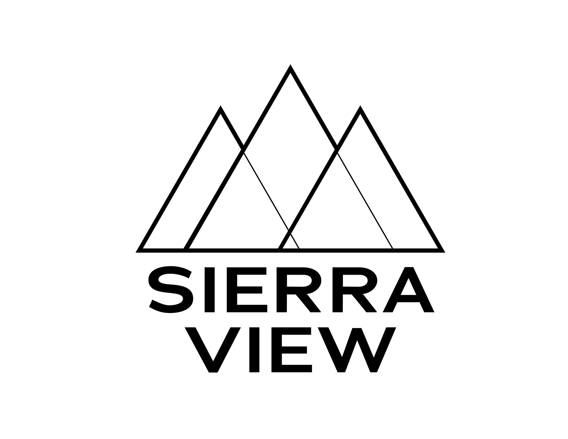
I proposed a wide range of options, ranging from very literal to increasingly abstract. James chose the overlapping triangles symbol that I had dubbed "triad." From there the next step was to refine the linework and study color fills for the final iteration.
Color Studies
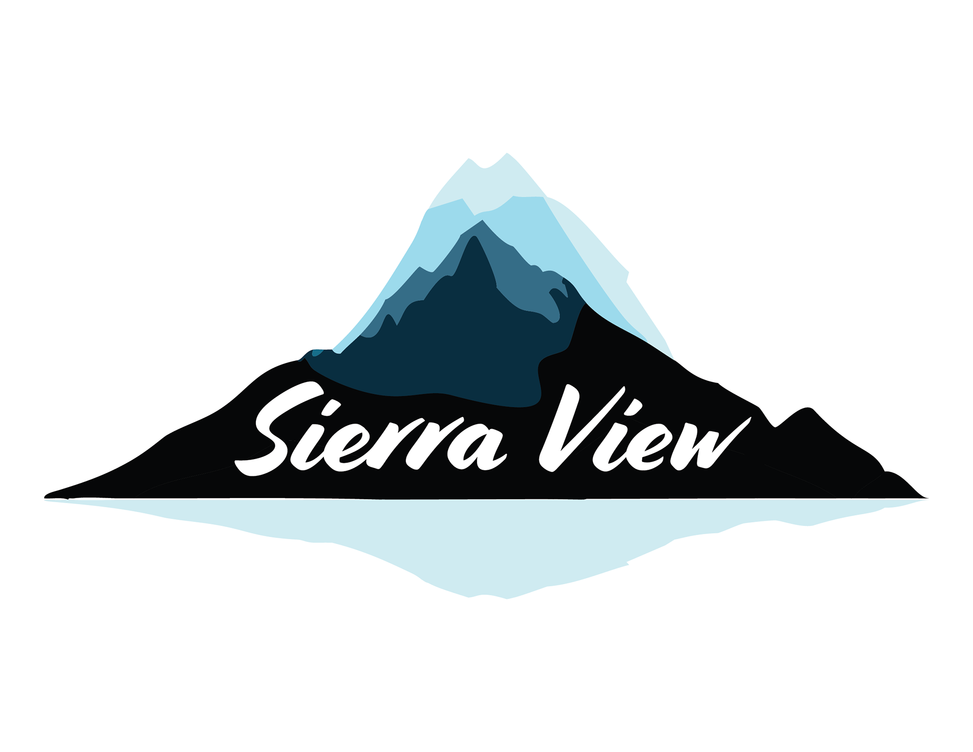
The most interesting opportunities with the overlapping shapes is the ability to create a variety of different colors where the shapes cross over one another. For this, I looked to nature and photos of the Sierra mountains in various times of day and seasons. You can also see how the lines of the symbol were refined and given three different weights to imply a certain order to the overlapping forms.

website
I created a website, as I often do for my clients. All this client needed was a simple one-pager. Images were chosen to establish his location near Roseville, California and included projects they had worked on in the past as well as a bold presentation of their tagline.

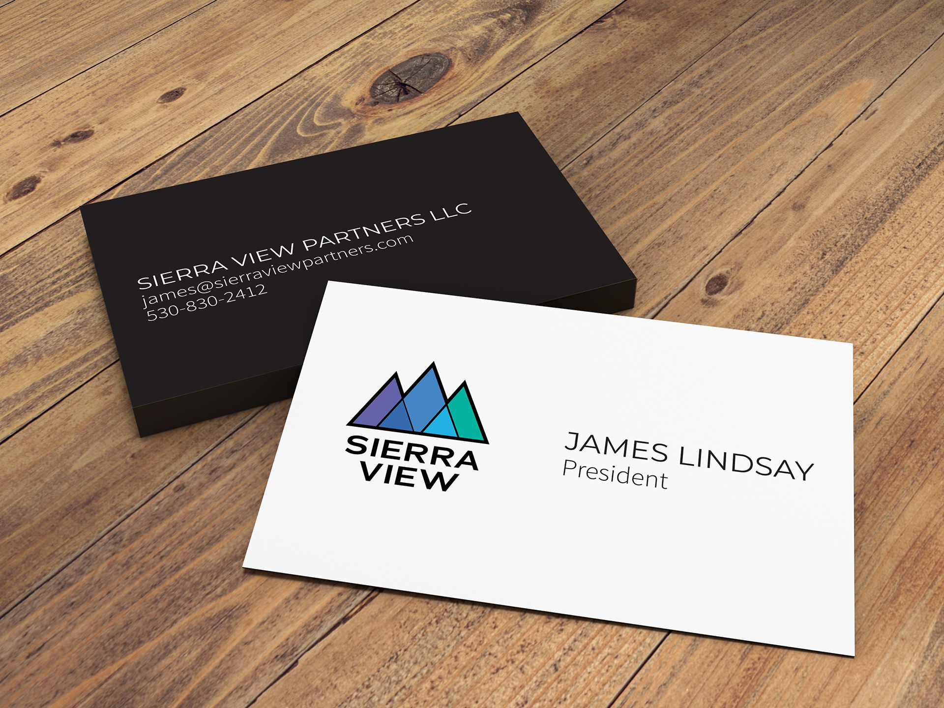
business cards
We went with a sleek, modern looking business card with a nice special touch. The cards are duplexed, meaning the front is printed on white stock, the back is printed on black stock, and the two sheets are glued together.
Standards Manual
I believe in style manuals to the point where I will not accept a client who refuses one. There really is no point in creating a brand only for it to get ruined immediately by poor execution. Of course, there is no guarantee a client will follow the manual, but at least it gives their brand a fighting chance.